In SaaS, ASP is the average price paid by a new customer at the moment they first convert to a paid subscription. Any followup expansion or contraction of the account is ignored.
Unlike ARPU, ASP can vary dramatically month by month and gives you a good idea of how effective your sales team is at driving up new customer deal sizes.
As a high level metric ASP is interesting but it gets much more meaningful when you start to filter down by plan and geographies – particularly when you have a larger sales organisation with teams responsible for different regions.
Let’s say you have two US sales teams, the first covering the Western United States and the second covering all other states.
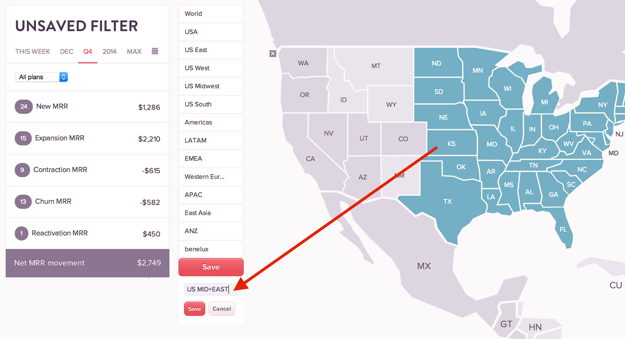
With ChartMogul you can quickly define your sales regions by simply selecting the countries and/or states you want to group and hitting save. I’ve called our two example regions ‘US West’ and ‘US Mid+East’. You can define these areas in a way that matches your companies sales regions.

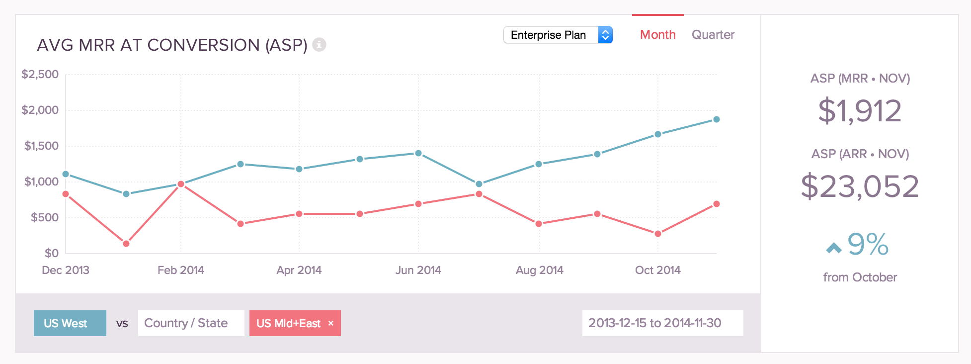
Once defined you can compare the ASP of these two regions. In this fictional example we can see that the ASP in ‘US West’ is pulling away from ‘US Mid+East’, approaching $2,000 MRR. We’ve also filtered the graph to just show the Enterprise plan, this is a good idea if like most SaaS companies you have lower plans that are mostly self-service – so you know you’re just looking at the work of your sales team.

It looks like the US West sales team is outperforming the US Mid+East team in this example – in terms of raising the initial deal size. Unless the US West team underperforms on upsell/retention they will gradually pull ahead on ARPU also.
This comparison is also interesting to do between countries and international regions. E.g. UK vs France vs Germany. APAC vs LATAM, etc.
