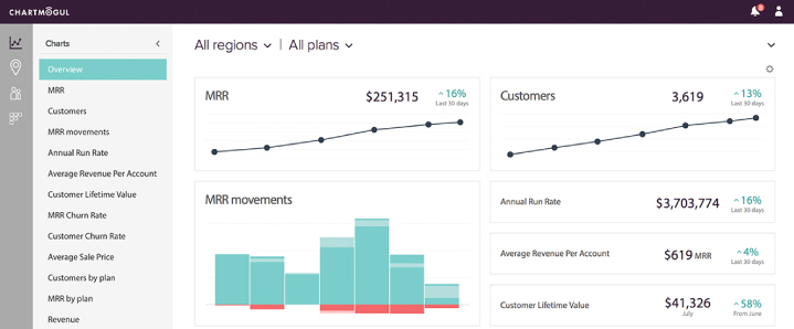
This upgrade has been rolled out to all users earlier today. It’s worth noting that your data, and how we calculate your metrics hasn’t been changed by these updates.
New features and enhancements
All new user experience
- UI has been completely redesigned and rebuilt.
- Clearer layout: navigation is on the left, segmentation along the top.
- Collapsible side panel gives you almost the entire screen to explore your data.
A beautiful new Overview screen that’s fully customizable
- Decide what graphs and metrics are important for your business, add them to your Overview and then arrange things using drag and drop.
Enhanced Cohorts
- New ability to click on the cells in the cohort analysis and discover what customer activities are impacting your churn and retention numbers.
New admin tool for managing plans
- You can now hide and show plans, rename them and create groups of plans just way easier.
And some minor enhancements
- The MRR movements graph can now be viewed in weekly intervals.
- There’s a new ‘Annual Run Rate’ graph.
To go along with this release we’ve also updated our website and product pages, we hope you like the new look! The Next Web were also kind enough to do a nice writeup about this release.
Below I explain some of the thinking behind this update…
Video transcript
We have some really big product updates to announce.
Firstly, it’s worth noting that none of these updates are going to affect your data, or how we calculate your metrics in any way.
The biggest thing you’re going to notice is a completely new UI.
A couple of months ago we looked at our product roadmap and thought: “how are we going to fit in all the new features we have planned, the UI just isn’t designed to be extensible”. So we took a step back and thought about what the perfect UI for ChartMogul might look like, taking into consideration what we have now, and where we’re going to take things in the future. What we came up with is a completely new design that’s really easy to read and gives our team the flexibility to add in all the new things we have planned.
We’ve put the segmentation controls along the top, and all the navigation is now on the left hand side – and it’s collapsible so you can maximise the available space for exploring your data.
We’ve introduced a beautiful new Overview screen that displays all the most important graphs and metrics in one place. And it’s completely customisable, you can decide what metrics are most important for your business and add those to your Overview screen, and then arrange things using drag and drop, it’s really cool.
We’ve also improved cohorts. Ever since we released Cohorts back in February, customer’s have been telling us they want to be able to just click on one of the cells in the cohort analysis and take a look at the underlying data, in the same way you can already do with the charts…so we’ve built this feature, and it’s really useful for investigating what customer activity is impacting your retention numbers.
Finally, the admin tool for managing plans has been completely re-built. You can now hide & show plans, rename them and create groups of plans to filter with, just way more easily than before.
We hope you love the new features and the new design. Thanks for watching.
