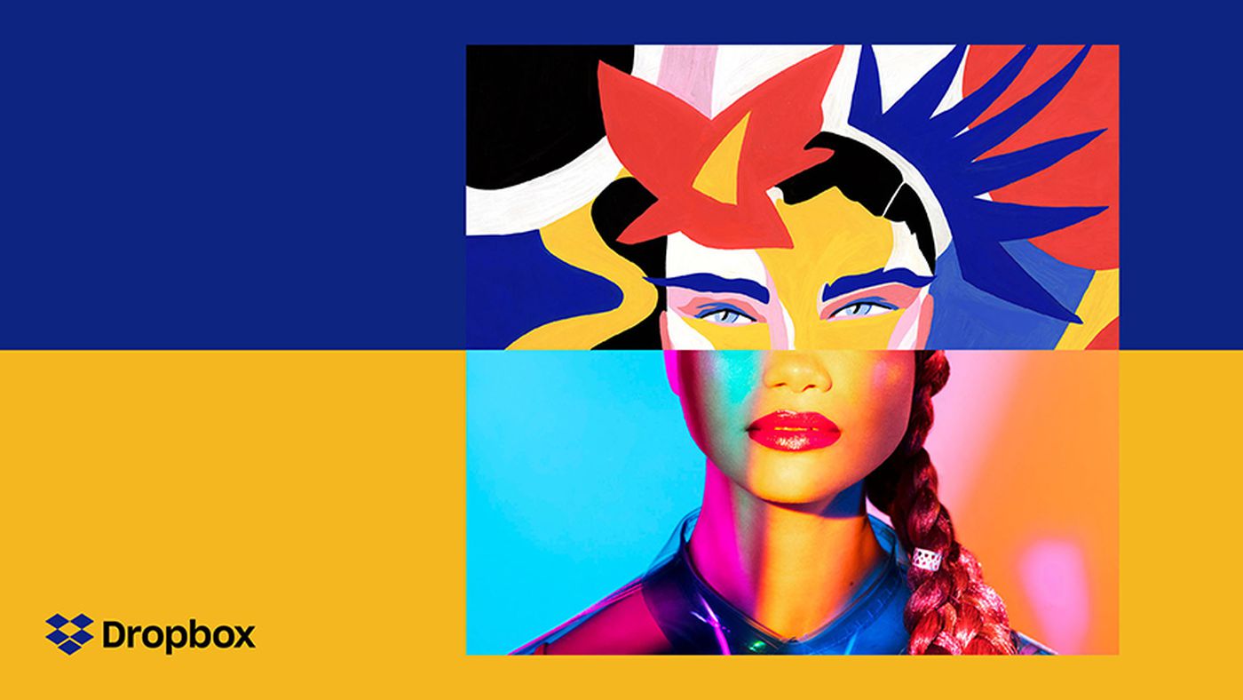
It all started with subtle changes — the inclusion of friendly illustrations, new colors in landing pages and tweaks to website copy. Many growth industries — SaaS included — congregate around new trends. These recent subtle shifts in approach to B2B brand have snowballed into a full scale rethink of what it means to produce and sell B2B software.
Pivotal moments in this shift include Dropbox’s 2017 redesign, from a predictable utilitarian experience to something far bolder:
More recently, when I read Typeform’s “behind the scenes” account of the company’s rebrand (almost a year in the making!) I realized the extent to which B2B SaaS companies were taking a ground-up approach to designing brand experience and asking fundamental questions like “who are we?”
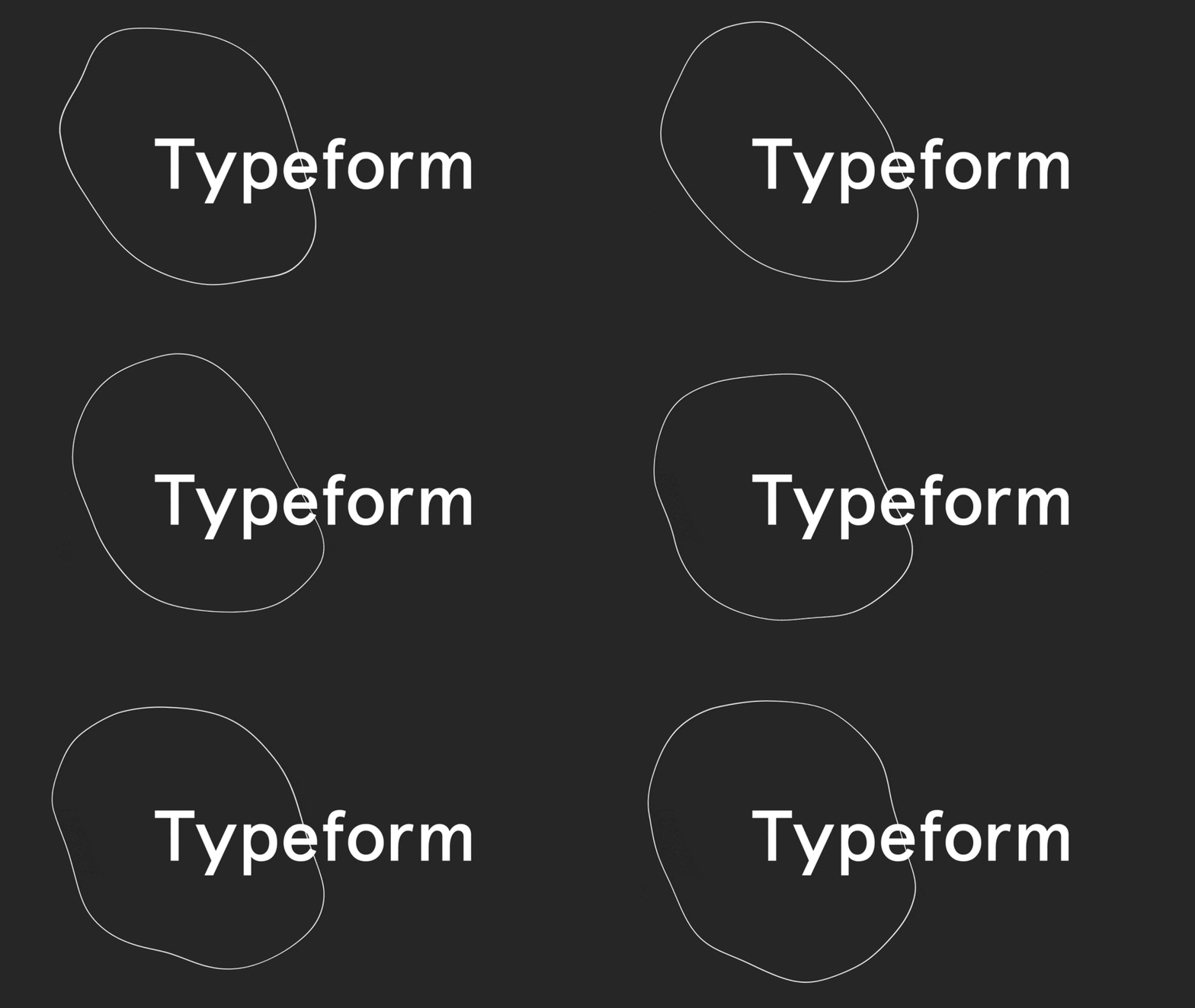
It’s fascinating to take a look at the companies driving such a movement and how they’re rethinking the way they present themselves to the world — let’s dive in!
Post-consumerization SaaS is here
The consumerization of SaaS is a concept that’s been discussed (perhaps to death) in recent years. It encapsulates a trend in B2B software toward a greater focus on the user experience (UX), often borrowing heavily from design patterns and trends on the consumer side. While this may seem obvious today (many B2B products offer a great UX), business software has historically lacked on this front — carrying the argument that UX is not a valid differentiator for business users who just want to “get their job done.”
“The new era is about mobile and SaaS apps that rewrite the way that work gets done. And while they are at it, the user is delighted with consumer-grade, ‘beautifully simple’ UI.”
David Skok (source)
I’m calling it now: 2018 is the year when B2B SaaS breaks out of its consumerization shackles.
We no longer need to evaluate products in the light of their consumer equivalents or make guesses as to where certain design features were borrowed from. It’s time for B2B SaaS to stand on its own as a mature category of software with its own thought leadership, unique user experience and branding.
Why now? What’s driving this?
“I’ve been thinking a lot lately about how we build the company of the future here at Drift. And I always come back to these three key ingredients:
We need to have the best products.
We need to have the best service.
We need to have the best brand.”
David Cancel, Founder of Drift (source)
The market for B2B SaaS is maturing. Venture capitalists are discussing the growing divide between SaaS and VC funding, with the potential for huge returns associated with VC becoming increasingly rare. (See The Rise of Non “VC compatible” SaaS Companies.)
“Founders must increasingly be aware that going the VC way might not be the best solution for them and that bootstrapping 100% or finding alternative ways of financing their company can be healthier.”
Clement Vouillon, Point Nine Capital (source)
SaaS is a “winner takes most” industry, where the biggest gains and growth are seen in categories where the business can dominate. Today, most categories are ripe with strong competition.
It’s never been easier to build a SaaS business. A wealth of building blocks exist — tools, infrastructure, APIs to code against — making the cost of entry lower than ever. But all of this brings increased competition. With so many similar solutions on the market, it’s difficult to differentiate your product on features alone.
So how else can companies differentiate themselves? Price — yes, but that’s a race to the bottom. Brand differentiation is the answer. A well-designed and established brand is a defensible form of differentiation that can carry a strong influence over users.
What is branding?
It’s easy to think of a brand as something that’s strongly tied to visual design. That’s definitely the case, but it’s also much broader than that. Take Shopify’s definition of branding for example:
“Branding is all of the ways you establish an image of your company in your customers’ eyes.”
Which is to say that it’s more related to the customers’ perception of your company than the visual representation itself. Of course, colors, logos and aesthetics are one of the primary ways we influence our branding — they set the tone for customer perception. But the list of elements that influence branding is huge:
- Company logo
- Color palette
- Web design
- Product user experience (UX)
- Blog content
- Email content
- Public speaking
- Company culture
- Customer support experience
…and much more.
If you want to read more about the relationship with brand and user experience from a content perspective, check out the post Is Your Content Marketing Making Brand Withdrawals?
Characteristics of a modern SaaS brand
On the surface it might seem like one company innovates while the others all copy, but there are a number of businesses in SaaS working hard to build a stand-out brand experience. If you look close enough, they all differ in some way or another. But they do share some commonalities.
This post covers many of the visual elements of branding — the web design, general aesthetic etc. — because these are the most publicly-visible components. However, I would expect that all of the companies mentioned have built a stand-out brand that runs much deeper than this.
Bold, strong visual identity
The days of bland B2B software websites are over. The cutting edge today is punchy, colorful and full of contrast. It’s like B2B SaaS finally drummed up enough confidence to step out of its grey hoodie and show off that technicolor t-shirt underneath.
Example: Intercom
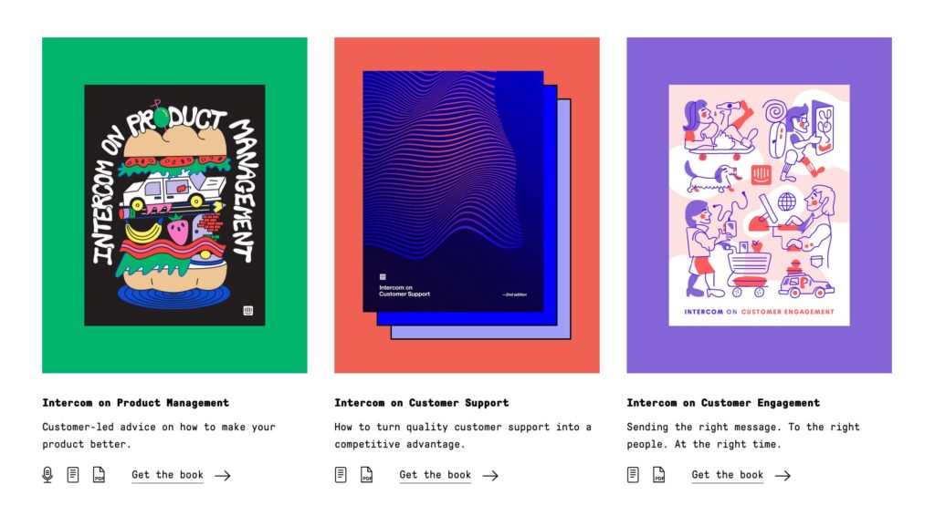
Intercom cemented its commitment to design and branding a few years ago when it launched the Intercom Brand Studio. This in-house team seemingly has a lot of freedom to think deeply about the overall brand experience of Intercom and contributes on a wide range of projects — from product design to e-books and even print design. The result is a highly differentiated, forward-thinking SaaS brand experience. No other B2B brands out there really touch Intercom in terms of brand experience, and many design trends are pioneered from within the Intercom Brand Studio.
Example: Dropbox
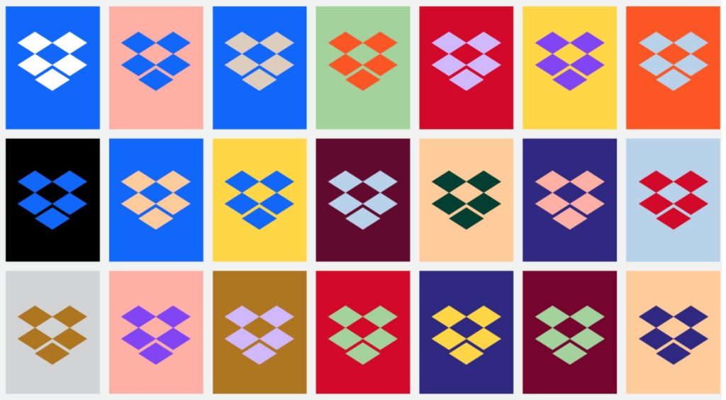
Dropbox is an interesting case because it’s a business with a large number of both B2C and B2B customers. Perhaps this contributed to its role in influencing branding in the B2B world.
Some years ago, Dropbox ushered in many of the current B2B trends of today — utilitarian, functional design with small hints of character through friendly hand-drawn sketches.
Their 2017 rebrand (which was likely in preparation for their forthcoming IPO) saw a radical departure from the old-style Dropbox. The new brand serves to represent a highly creative aesthetic reflected in its target user base. While it originated as a cloud storage solution, the Dropbox of today is focused on tools for creation and professional productivity.
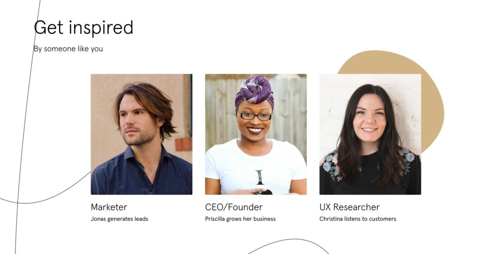
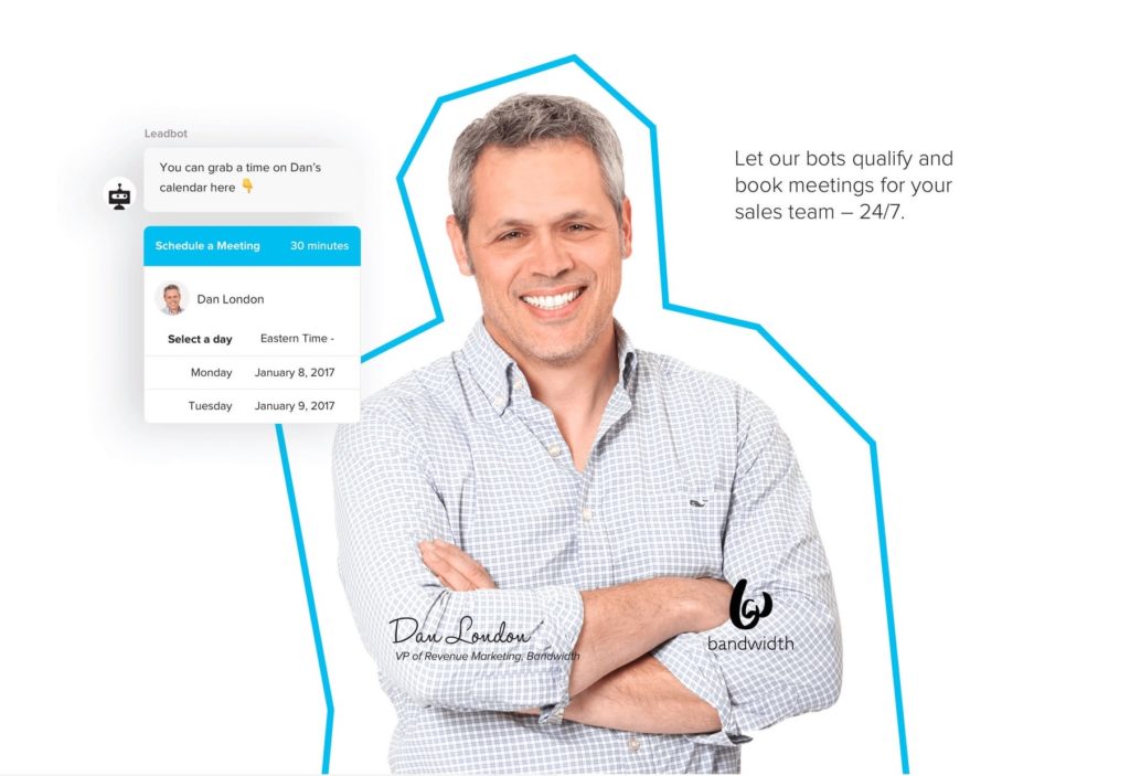
Real people, original images (stock images are destroying souls)
There’s a real problem with most stock images: they look like stock images.
While they used to be a cost-efficient way to leverage professional-quality imagery on your company’s website, the kinds of stock images used in B2B software have converged on a common aesthetic — there’s not really much differentiation any more.
Secondly, stock images are just too generic. Because they’re designed to fit a large range of clients and uses, they don’t do a good job of accurately conveying your specific brand, and they’re certainly not tailored to your company and its culture.
Finally, with massively popular free stock outlets like Unsplash, commonly used images can even be recognized in multiple places around the internet. What worse way to differentiate your brand than to use a hero image that appears on other sites in the industry?
B2B businesses in 2018 are realizing the true value of using real people in their images — whether that’s real customers (see Typeform below) or employees. This may require a greater upfront production cost than a purchased stock image, but the end result is far more engaging and relevant to the brand.
Example: Typeform
Example: Drift
Friendly, abstract illustrations
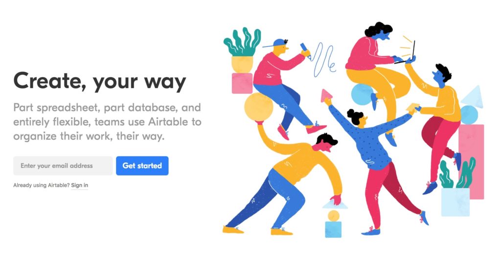
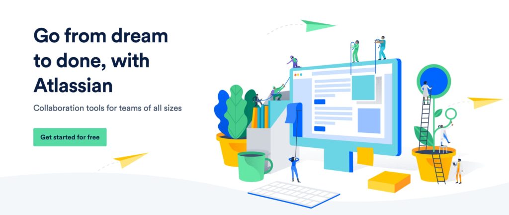
There’s no doubt you’ve identified the new trend in illustrations on SaaS websites. This imagery comes across as friendly and approachable, while conveying the product’s values in an abstract way. In many scenarios, these illustrations have replaced the generic looking stock images previously occupying the “hero” slot on the landing page.
Example: Airtable
Example: Atlassian
Simple, accessible language
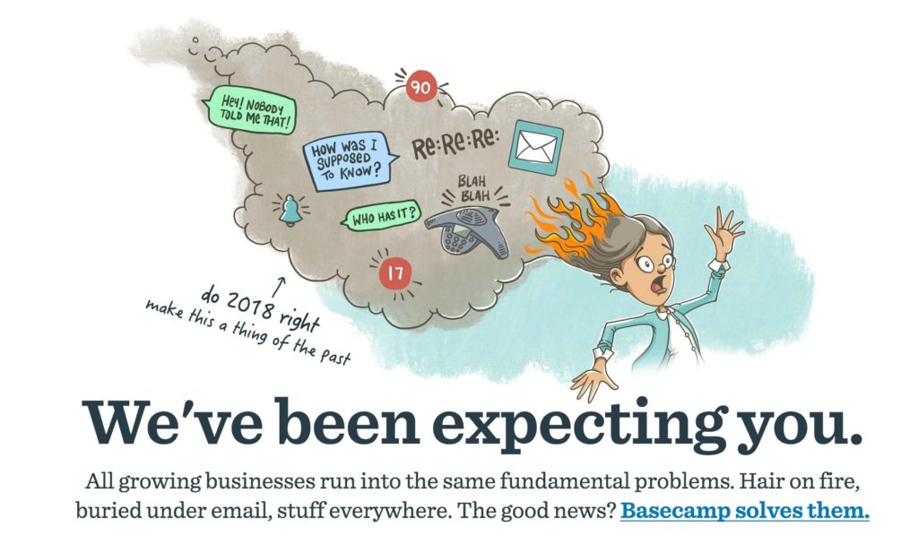
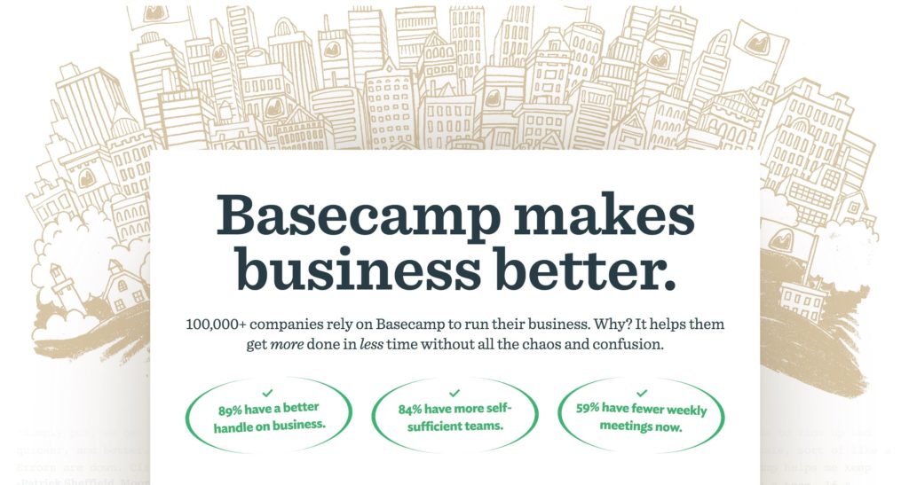
Kiss goodbye to overly colorful, buzzword-filled copy! Simplicity is the flavor of the moment when it comes to the language of B2B businesses. But it runs a little deeper than simplicity alone. The companies pioneering in this area are using copy that’s refreshingly direct — in some cases, surprisingly so.
Complex copy is no longer recognized as a marker of sophistication, perhaps as a result of its overuse in recent years. In 2018, headlines are best served short, punchy and to-the-point.
Example: Basecamp
Extension of the brand throughout the user experience (including the product)
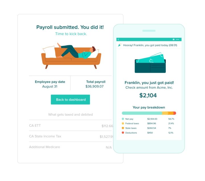
Engaging people on your company website with a captivating brand is a good step toward B2B success. But businesses are realizing the importance of carrying this experience far beyond the website itself and into the complete product experience.
In SaaS and subscription businesses there’s no one-time purchase. Instead, businesses need to attract customers and keep them subscribed by driving significant ongoing value. This requires a holistic approach to branding that’s inextricably tied to user experience.
Ask yourself this in 2018: Is your website writing checks that your product can’t cash?
Example: Gusto
Emotive
Example: Typeform
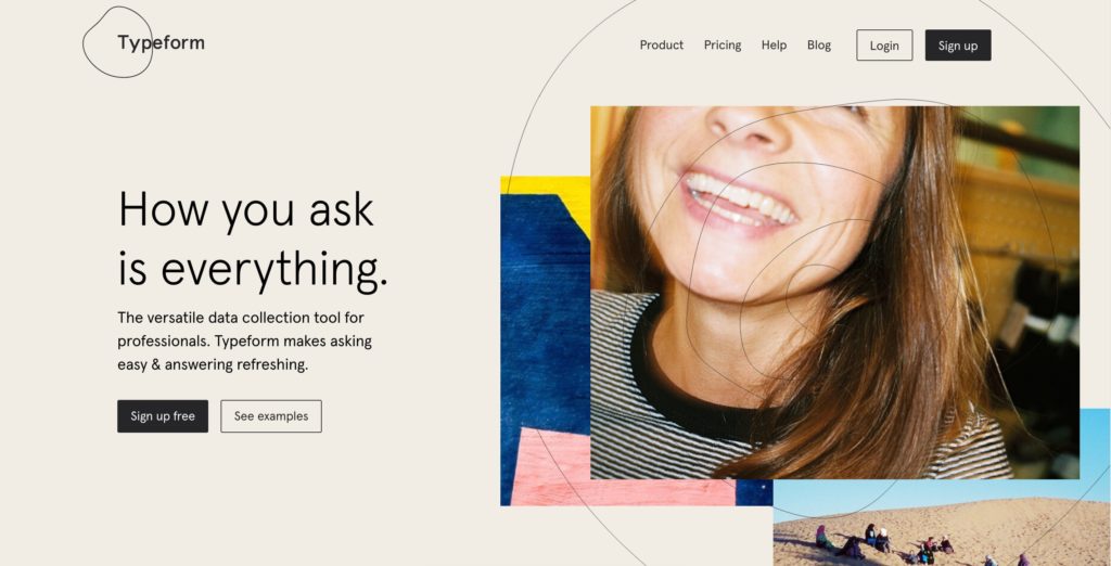
Does emotion really belong in business software? Typeform would argue so. With their recent rebrand (which you can read about here), the team stripped everything back to first principles and faced existential questions like “Who are we?”
“By listening to our customers, we realized that people often refer to Typeform with words like “love, fun, beautiful.” That’s some pretty emotional vocab for a data collection tool, right?”
Alex Antolino, Creative Director at Typeform
After a year-long process, the end result is packed with emotion and personality.
It’s time for B2B branding to stand on its own
The above shifts in B2B companies leading them to leverage great user experience and effective branding has not happened overnight. We’ve seen several phases over a span of multiple years:
Phase one saw the enterprise businesses of yesteryear entirely focused on product utility and feature lists.
In phase two, businesses awoke to the possibility of great user experience and branding in B2B software. Some companies in the space realized they could innovate with a thoughtfully designed, delightful UX. These companies were largely borrowing from ideas and concepts in the consumer space.
Phase three is where we’re at today. Successful B2B brands are no longer chasing the shadows of their more innovative B2C counterparts — these companies now stand on their own and are paving the way for the rest of the industry to follow suit in creating a stand-out brand experience and truly differentiate themselves from competitors.

