
This was one of those ideas we knew right away we had to build. I actually got goosebumps just thinking about how cool it would be.
Not only does this look cool, but it gives you insights faster than almost any other way.
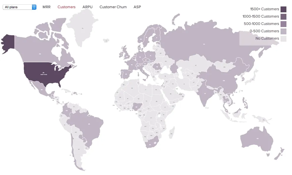
What insights can you get from this?
- Identify the countries/states with the worst churn situation (then investigate what might be going wrong there)
- Reducing churn in the worst areas will bring your global churn rate down
- Where the money is, and isn't
- Quickly see how how your customers and MRR is distributed
- And because you can also filter by plan, you can see which plans are popular in different places
- Identify growth opportunities
- Perhaps your ARPU is super-high in Australia but you haven't focussed on that market at all (maybe consider channelling some marketing spend there to get more of those high spenders)
- Maybe your MRR is very low in large markets like the UK (perhaps a good place to invest)
- For US focussed businesses perhaps your customers are highly concentrated in one or two states (lot's of opportunities in other parts of the country)
- Benchmark your regional sales teams by heat mapping your Average Sale Price (ASP)
- Read about Using ASP to benchmark your SaaS sales team
While this data can be surfaced using tables or graphs, we can’t think of a way to make this more rapidly digestible than using choropleth maps.
Some future directions we could take this
- Mix in country data like population, GDP, market size, etc.
- Mixed with your subscription data this could give a sense of your market saturation and where to focus efforts.
Dive into your heat-map and visualise your recurring revenue and all other key subscription metrics accessible with ChartMogul. Leave a comment below if you have any questions or suggestions!