
Segment, save, share. Our newest feature makes it easy to create and save custom charts that the entire team can access.
ChartMogul is really great when it comes to letting you drill down into your data; however, up until now we’ve required you to rebuild your custom views each time you load the app, or bookmark a URL. This has added a bit of friction for users who love to build complex charts comprised of multiple segments.
Today, I’m thrilled to share that we’re making ChartMogul faster and easier to use with custom charts. Now you can save your favorite charts and easily access them again, and again, and again. Even better, you can make sure your most business-critical charts are shared with the whole team.
“I love how custom charts put answers to my daily worries at my fingertips.” Sergei Anikin, CTO, Pipedrive
How custom charts work
When you go to your Charts view, you’ll see a Save button above every chart. Once you’ve created the perfect chart, click that button and a modal will guide you through the process of saving and sharing your chart.
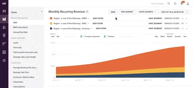
To save your chart, you’ll need to fill out a few details:
- Name: Make sure this is descriptive. A best practice would be to include the metric name and segment so it’s clear what’s being measured.
- Available for: You can choose to keep charts private to your account, or if you're an admin, share with all ChartMogul users on your team.
- Chart time-period: Choose either a dynamic time period (e.g., last 365 days) or fixed time period (e.g., January 1, 2017–December 31, 2017).
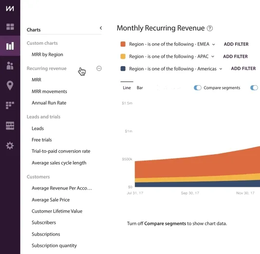
After you’ve saved your chart, you’ll see it added to a new section of your Charts sidebar called Custom charts. Your custom charts are organized based on recency, but can be reordered by dragging and dropping.
We’ve pre-loaded your account with some of our favorite charts, which you can explore, edit or remove.
Bonus: reorganize your ChartMogul charts navigation
Building on this, we’re giving ChartMogul users another way to customize their Charts view: drag-and-drop reordering of the chart categories in the sidebar.
You can reorganize the Charts navigation to reflect the metrics that are most important to your business. For instance, if your business doesn’t offer a free trial, you might want to move your Leads and trials section to the bottom of the menu. Or if you’re laser-focused on reducing churn, you can move those metrics to the top of your menu for quick access. These changes will only be reflected in your view, so every member of the team can adjust their ChartMogul Charts menu to fit their needs.
These latest updates are intended to make ChartMogul even more personal, and your business more efficient in how it analyzes and acts on revenue data. I hope you enjoy using custom charts!