Conferences are becoming an increasingly important part of running a SaaS business. They are a chance to meet existing and prospective customers, learn about new trends and topics in the industry, and — above all — get inspired.
When it comes to events, SaaStock Dublin is the highlight of the year for our team. The 3 days of the conference are jam-packed with great people to meet, interesting talks, and many opportunities to get to know the people behind the companies you work with.
For us at ChartMogul, SaaStock is also the best chance to get our product in front of new customers and to improve the knowledge of our existing audience.
So, the conference experience we create is the cornerstone when it comes to the success of our efforts.
We want to be memorable and compelling, so that we maximize our time (and spend!) onsite and to help with follow up.
You know that slew of emails and calls you get from salespeople after a show? How can you remember that conversation or product? In our case, creative helps. A lot.
In addition, the design team at ChartMogul plays a central role when it comes to the marketing collateral our team hands out and the email campaigns we send out after the event.
Tradeshow season is nearly here. Recognizing that not every startup or SaaS business has a track record with events, we thought it would be helpful to share our insight about how our design team participates in making conference attendance a success.
Things to consider when designing the booth
Having a successful experience at a conference starts long before you and your team get on the plane to the conference location. Usually, we start our conference prep at least 3 months in advance by thinking about the following aspects.
Floor plan
Once we register for a conference, we choose a location. Naturally, we always prefer that we’re in a high traffic area near the entrance or close to areas reserved for coffee and networking.
You’ll want to ask yourself questions like:
- What do your buyers care about?
- What areas of the conference will they want to explore?
Answering those questions help us come up with an overall concept for our conference experience — we know how to design a booth that will attract conference attendees and what messages to promote through our booth and our collateral.
Conferences often organize the floor plan by industry or category.
It is always important to be in an area where you’re most likely to meet your ideal customer.
For example, let’s say you’re selling learning management software, but you know your customers are struggling with analytics. In this case, it would probably be better to get situated in an area with all the other analytics products, rather than set up your booth next to all the e-learning platforms.
Booth layout
For conferences like SaaStock, we usually opt for a big booth with two walls, two stools, a counter, and a TV.
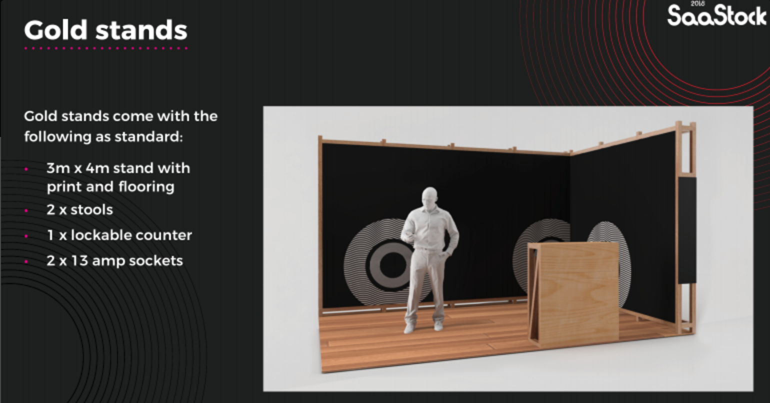
We choose this type of booth because it allows us to build a focussed space which presents our brand in the best possible way. Having two walls also makes our presence more remarkable and gives us the chance to display more information.
When conference attendees approach us, there’s little to distract them, so they get to connect and understand what we stand for.
We believe this is the best way for us to leave a lasting impression with them.
Messaging and booth experience
Designing the booth experience starts with a joint discussion with the marketing team. The goal of this step of the process is to come up with an overall vision/message for each specific tradeshow.
Once we have agreed on the overall vision, the design team starts work on the overall booth experience. Our goal with this is to create an experience that is:
- Memorable: When your sales team follows up with prospects, do they remember what happened at your booth?
- Crisp: Is the design simple, and straight-forward with a short and clear message?
- Productive: Do conference attendees leave your booth having learned or benefited from the conversation?
- Cohesive and on brand: Can you be easily identified and found?
Overall design concept
The mission of the design is to catch people’s attention and make them want to come in.
To do that, the booth must look bright, open, clean and inviting — i.e. it must create a friendly atmosphere.
The tradeshow floor will be filled with competitors, giveaways, and almost certainly, lots of noise. Therefore, the role of the design we use is to stand out and create a remarkable experience that can capture attention in a second or two when attendees walk by.
Furthermore, in the huge venue, the distance from attendees is another important thing to consider. Simple, bold, and clear graphics with effective short messages are enough. Never overdesign or fill in every empty space.
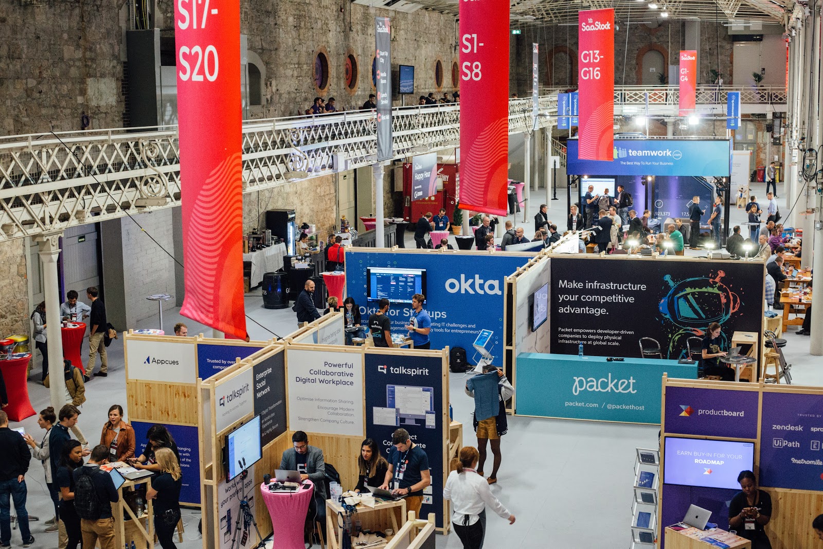
There’s no point in trying to “sell” the product with overcomplicated design and/or lots of messaging — too much text with lots of graphics and too many different colors are more likely to confuse visitors than earn you attention.
Once people approach you at the booth, you will have time to talk about your product in detail. Good simple design creates that initial attraction.
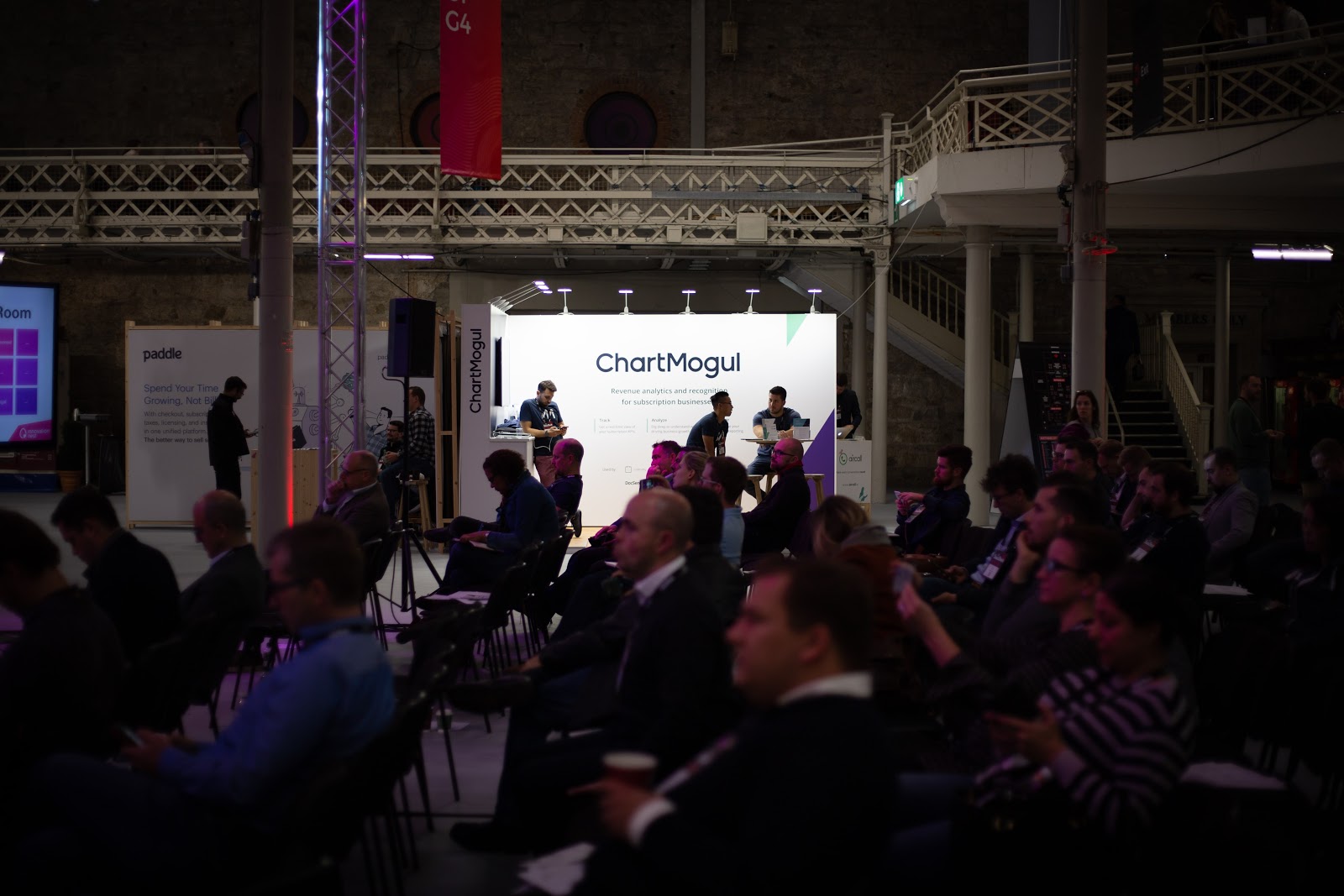
Here are some things we’ve found to work really well when we’ve worked on our booths in the past:
- Color: To make the message standout better, we are selective with color. Using too many colors can make the whole booth look messy and can confuse the main message.
- Light: We’ve found that the use of LED lights works well with a white background.
- Screen: We install a television screen — typically near one side or another — to showcase our product. This way, attendees can see ChartMogul in action on site.
Booth design at SaaStock 2018
Here’s an example of one of our recent booth designs. This was shortly after we launched a new brand, so the concept of booth design was focused on promoting our new look.
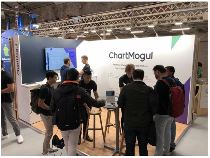
As I mentioned above, the LED lighting worked really well with the design concept. On the other hand, one of the things we could have done better was to use bigger font in order to make our messaging more noticeable.
Marketing Collateral
Swag. Freebies are probably the most fun part of every tradeshow and booth experience. Our brand is clean, modern, and serious and our collateral has to reflect that.
We always want our trade show materials to be memorable and give a good impression to attendees.
To get attention, we prepare giveaways that won’t take up a lot of room and will stick around after the show for weeks to come. This year we are planning to prepare:
- 3-4 different cheat sheets on A5 handy size
- Business cards
- Logo stickers
- T-shirts for employees and attendees
- Logo printed laptop camera cover
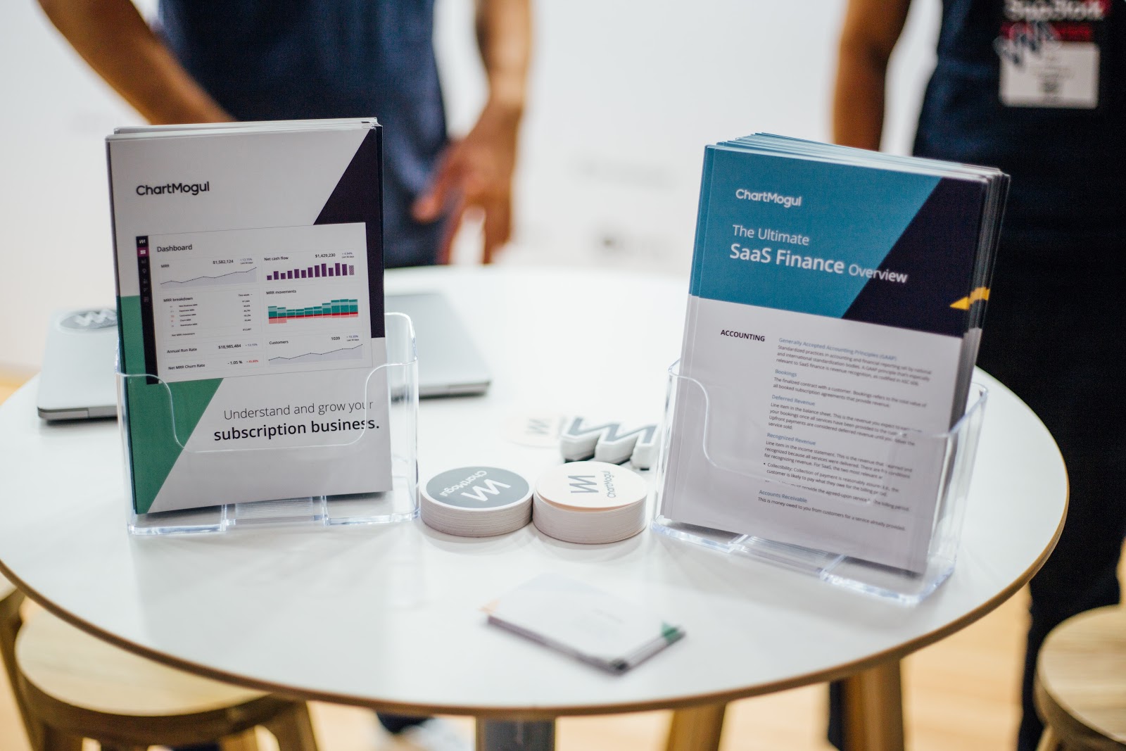
Some of these seem to be pretty standard and repeatable (business cards for example), but for some of the other material we produce (brochures), we may try to come up with a design which is tied around the specific campaign we’re using for the conference.
After the Event
The event might be done, but that doesn’t mean our event work is done.
If the event’s gone well, that means our team has a bunch of warm leads to work with.
After the event, we always make sure to send out follow-up emails to the people we connected with during the conference. The design and sales teams work on this together — we create an email template that’s tied to the visual concept we used for the conference. The sales team provides the details, which allow us to send out a personalized email to each customer that we spoke with.
Good design is key for SaaS conference success
We believe in good design and try to make it an integral part of every aspect of our business — from the product to our conference participation, our creative team is always heavily involved in our preparations.
For us, the creative process is not just an opportunity to put up an impressive booth and wow conference attendees, but also a chance to project what we believe in as a team. We find that this allows us to start and nurture many relationships which turn into meaningful long-term partnerships.
