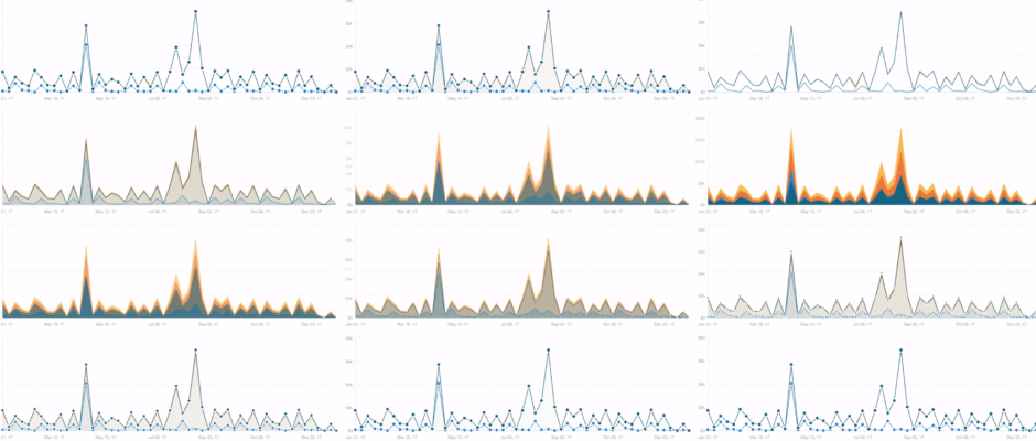
New chart transitions are here
Recently, we introduced transitions to charts in ChartMogul. This means that when you make a change to a chart’s dataset, you’ll see the chart animate the change.
The project was started out of necessity — upcoming work on larger charting features such as dynamic updates (through an animation) mean that all of our charting front-end needs to have this capability.
Although it might seem simple on the surface, there’s a lot of thought that needs to go into animating changes to data in the UI. What’s the best way to demonstrate a change in a dataset? It’s a simple question, but it’s hard to answer.
Take a simple bar chart, for example. Each rectangle on the chart represents two things: a date and a value. When the data changes, the chart needs to accommodate new data points in a way that’s not confusing. One solution we considered for this was zeroing each rectangle, and then bringing them back once they’ve been updated.
Here’s how that would look:
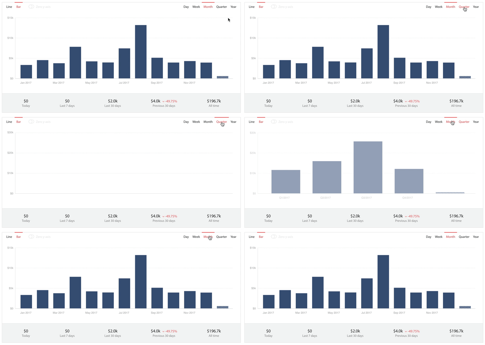
In practice, this is actually worse than changing the bars without a transition. It feels slower to complete, and it’s hard to understand the change to the data — visually comparing the previous value with the new one is hard, because of the transition to zero.
We also considered updating the bars without zeroing their Y values:
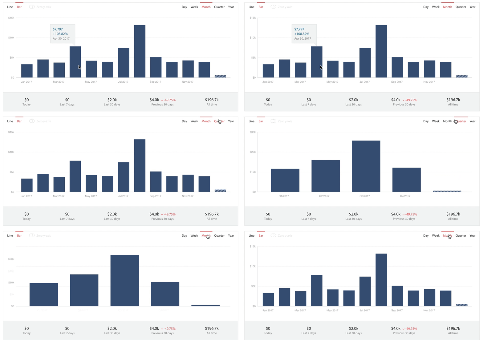
This does a better job of conveying the difference in the two datasets to users, but it’s still confusing. The bars change what they represent (the bar that represented August represents the bar for July after the transition).
Introducing object constancy
To solve this, we employed an approach called object constancy. Mike Bostock, creator of the D3 visualization library frequently references the term, which means each chart element (like a bar) is “locked” to a specific time. In other words, the bar for August will always represent the bar for August.
“Animated transitions are pretty, but they also serve a purpose: they make it easier to follow the data.”
Mike Bostock, creator of D3.js
Though object constancy is a new concept for me, it’s quickly become the root of how we transition chart states.

This subtle change in our approach makes it possible for us to link a bar to specific data. When elements move around in complex ways it’s still possible for users to follow what’s happening to the data — a fundamental goal of UI transitions.
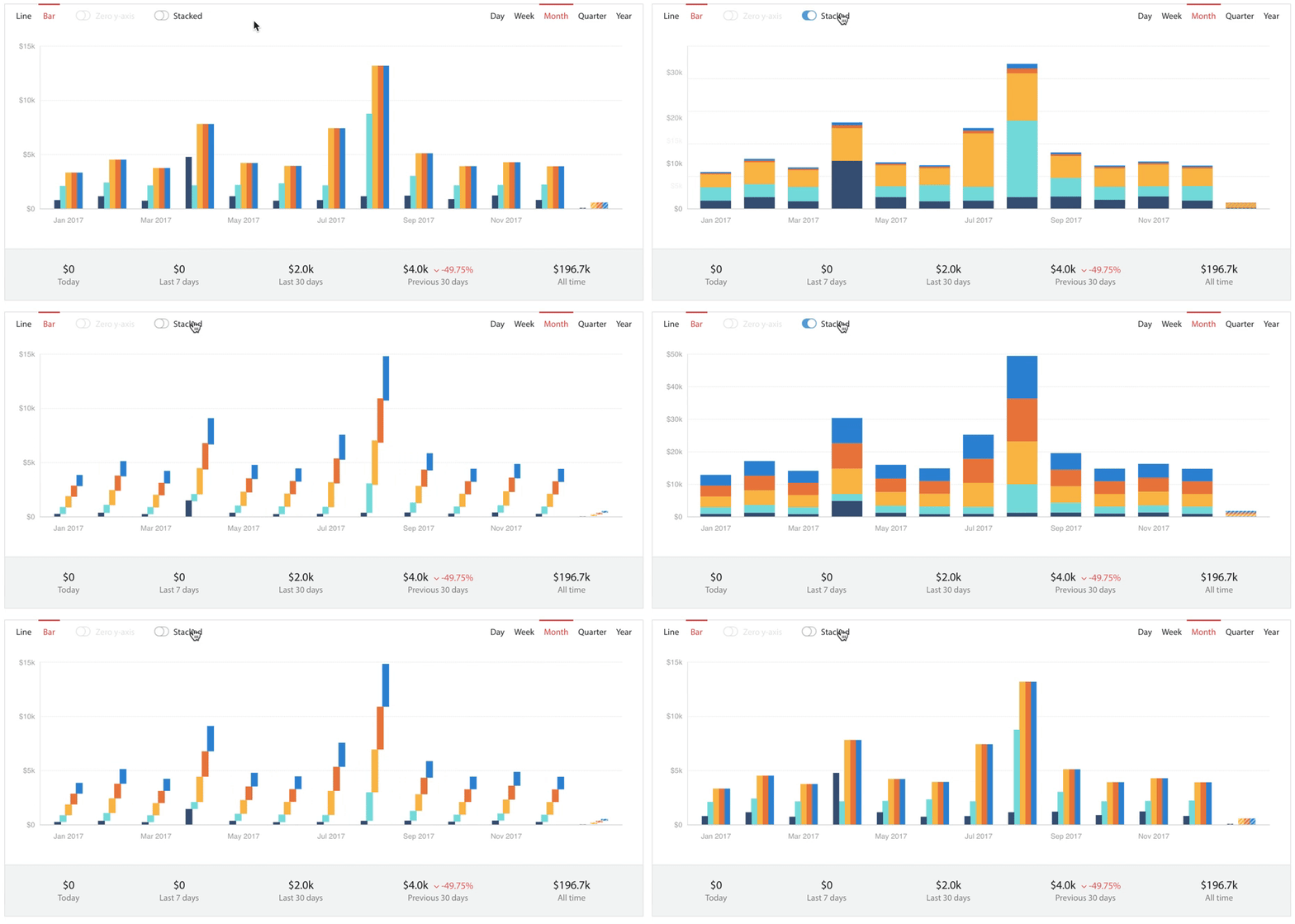
Good transitions reduce cognitive load on the end user. They make it easier to understand what the data represents, even when the way it is represented changes in complex ways.
Animations as a perceived performance boost
“Animations can be a good tool for making users perceive things as faster than they really are.”
– Michaël Villar on Medium
This really interesting idea from Michaël was in the back of my mind when working on this project. Everyone can see the value in making software feel faster, and this can be taken a step further when rendering graphical changes.
D3 transitions can certainly make an update feel faster, but a good transition in a chart context can provide more information than is in the two datasets alone. A transition, in displaying the difference between the datasets, can almost display a third dataset.
Animating a change to a chart isn’t enough. A good transition must fit the change. For example shifting bars either right or left, depending on whether the time series of the data had gone forwards or backwards in time.
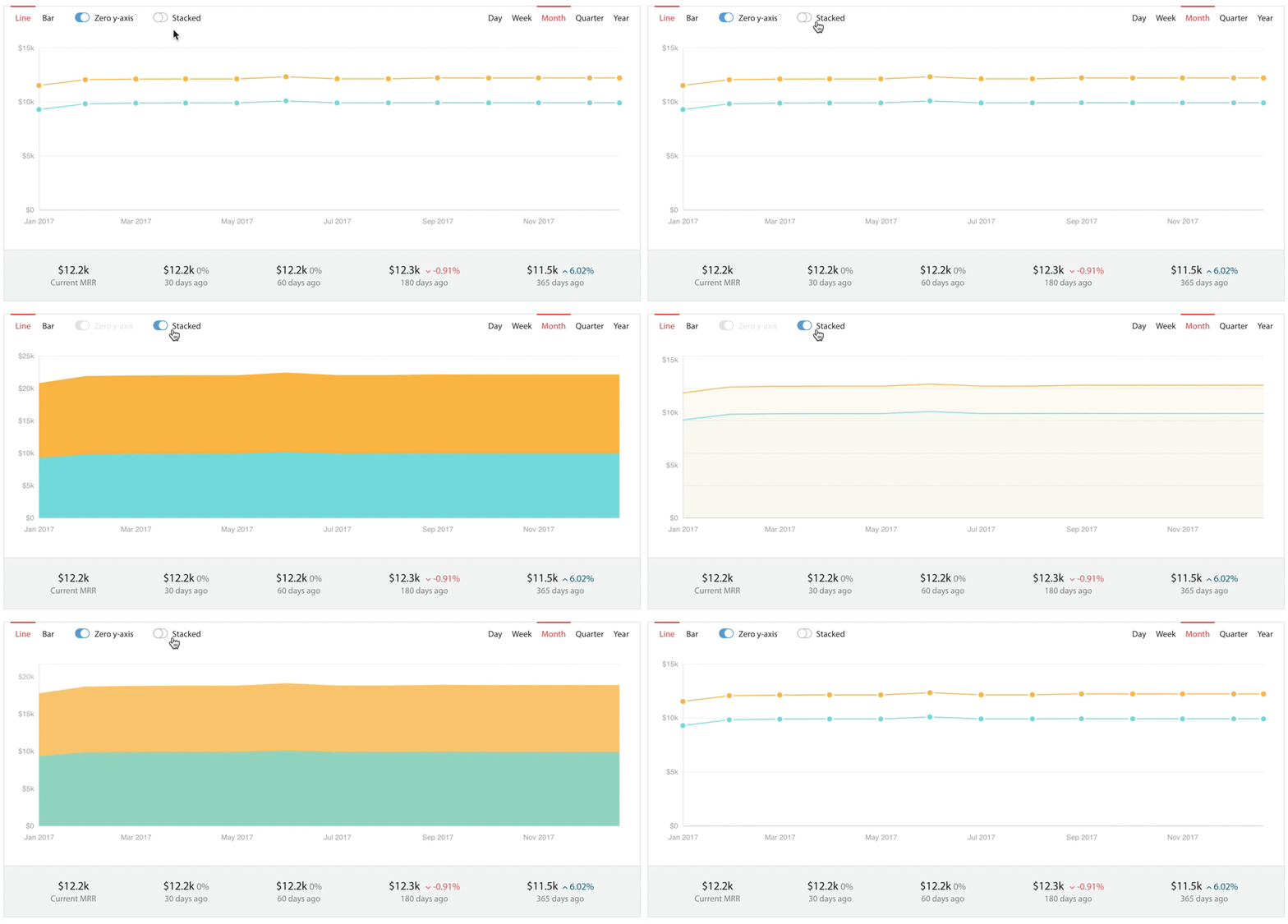
Heer and Robertson wrote in their 2007 paper that animation can improve “graphical perception at both syntactic (object tracking) and semantic (change estimation) levels of analysis.” In other words, as we’ve found, transitioning charts with animations makes it easier to tell stories with data. It’s easier for humans to understand complex differences and to spot patterns when you transition between two datasets (e.g., when filtering a view of your data).
Plus an actual performance boost
While adding support for transitions in ChartMogul, we also took the opportunity to make speed improvements to the way we render charts. Previously, any change to a chart would cause the chart’s SVG to be deleted and recreated from scratch. This might sound dramatic, but it wasn’t noticeable to the end user as it would happen almost instantly.
However, as we wanted to display transitions between datasets we required a different approach. Now when you make a change to a chart, elements are updated rather than recreated. This is harder than deleting and recreating an SVG each time there’s a change — we now need to handle both the creation or “entering” of elements and also the update and exit (removal) of elements. The end result is that the rendering charts in ChartMogul is now far more efficient.
These changes wouldn’t have been possible without a huge amount of work being done on the back end of the ChartMogul platform. Animations delayed by long wait times for data would undoubtedly frustrate users. Due to recent back-end projects, new datasets are returned incredibly quickly (100x times faster than before). This allows us to begin an animation pretty much immediately once a change has been made by a user.
I learned a lot about D3 and transitions during this project. Thanks go to Nick, Yuta and Dmitriy at ChartMogul for their support, and special thanks to Mike Bostock for D3.
Thanks for reading! I hope these changes help ChartMogul users gain more insights from their data, in an altogether improved experience.
If you have any feedback, I’d love to hear your suggestions and/or critiques in the comments below.
