ChartMogul Styleguide
We strive to produce original, eye-catching, and inviting visual style and apply them coherently across our products and services. Below are some of our distinctive design styles that we have developed over time as our signature.
Color
While we’re generally open to using broad range of colors, they need to be carefully selected to stay coherent with our branding. It’s also important that colors in a set compliment each other with good contrast ratio. The color swatches shown below are only examples to give you an idea of the tonal range.
Light
Though we sometimes use dark colors as a background with text in white, more often we choose light colors as a background with text in dark colors.
Medium
Bright, saturated colors are used on highlighting elements such as buttons, geometric shapes.
Dark
Darker colors are mostly used on text elements where leligibility is important. Darker colors can also be used as a background in a dark theme.
Graphic
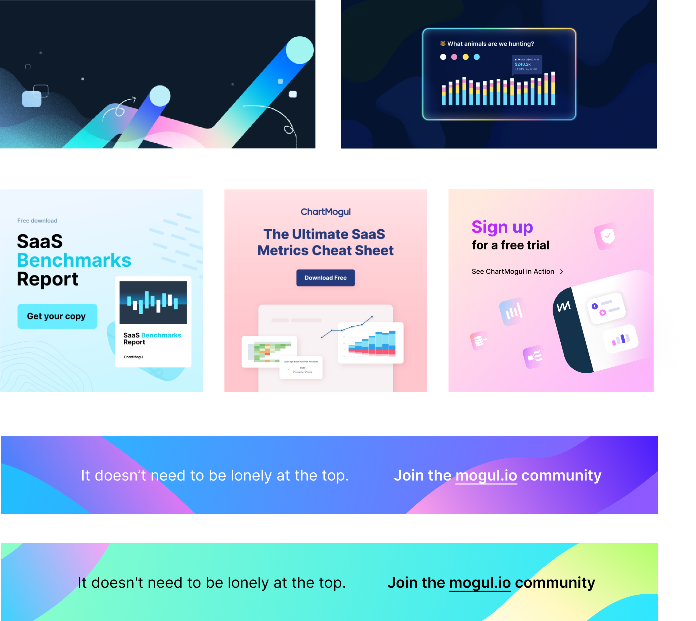
Our signature graphic style utilizes bright and subtle gradient colors as a foundational element. The key is to use them sparingly and carefully choose which element is to be in that gradient style and compliment other elements that are in conventional bold style.
Illustration
Our signature illustration consists of sophisticated layering, geometric shapes in perspective, and inviting yet glowing colors. A well executed outcome gives a 3d pop as a result. They are produced in vector as the format gives crisp look on all screen sizes and can also be recycled for further development in other applications.
Photo
unplash.com is our go-to place to source an image for our blog headers as it offers a great range of abstract images that don’t look too much like a stock image. A possible candidate of an image should capture the essence of a story in an original and abstract way. An image that is too specific to the subject may feel uninteresting and cliché, not to mention it’s almost impossible to source one.
These images not only look eye-catching and visually interesting, but they also can be interpreted in various ways.

These examples not only look cliché, they are just too generic and screams that it’s a stock image.

Typography
Inter is the primary typeface for our websites. To accommodate for our viewers with different eyesight conditions, we make sure to set up font style works across different browsers, and different mobile devices.
Grow Your Recurring Revenue
- 60px (+) · Bold
- Hero Title
Grow Your Recurring Revenue
- 38px · Bold
- Section Title
Experience the features of the Subscription Analytics Platform that will transform your business.
- 20px · Normal
- Lead Paragraph
Real-time Monthly Recurring Revenue updates ensure you’re always working with the latest data. Track New Business MRR, Expansion, Contraction, Churn, and Reactivation.
- 15px · Normal
- Paragraph
Formatting
Along with the typographic scale, correct formatting is required to achieve great design. The thoughtful use of text formatting which includes alignment, capitalization, and spacing creates a great first impression, and improves readability.
Left alignment
The left alignment of the text is default as it's easier on the eyes in most settings.

Center alignment
Sometimes we deliberately want to draw our audience to stay in the center of a page. In such settings, we choose center alignment. Center alignment can be a great choice with a small body of text with minimal surroundings.


Spacing
Generous spacing is often needed to set clear visual hierarchy. Padding and margin are the two key components for spacing and here are some good examples of what we consider a good use of spacing.

Button
Buttons are a vital element in creating a productive user experience. Buttons allow users to take actions, and make choices. They should be easily findable and identifiable while clearly indicating the action. We typically categorize these buttons as primary and secondary action on our marketing websites.
Primary
The primary action on a page needs to have a stronger visual weight and display a distinct contrast from its surroundings. It should be the visually dominant button. Colors on these primary buttons can vary by their respective theme.
Secondary
Secondary actions should carry the weaker visual attraction. Reducing the visual prominence in the secondary action help set clear visual dominance along with the primary action.
Usage
An example of a singular primary action button.
Icon
Icons are the visual expression of a brand and product. They communicate the core idea in a simple, bold, and friendly way. While each icon is visually distinct, all icons should be unified through execution.
Taxonomy
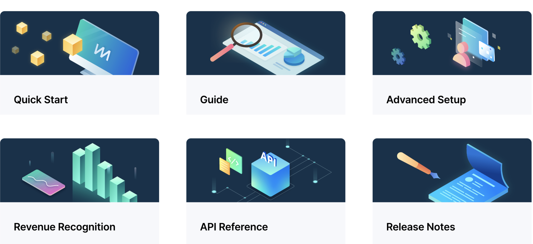
Taxonomy icons need to communicate the characteristics of a category in a direct and succinct manner with a clear form and shape. We use a set of outlined icons that are also treated with rounded corners to convey modern and inviting visual.
Contextual
Contextual icons can be more playful, experimental, and abstract in various style as long as it captures the concept of an idea. The icons can be outlined or filled but the style should stay consistent across the board.
Logo
Wordmark
Our standard way to represent ChartMogul identity is by using the wordmark.
Do not use gradient on the wordmark
Do not use color that affects legibility
Do not tilt or skew the logo
Logomark
The logomark ‘M’ is an extension of ChartMogul identity. Therefore its standalone use is only allowed inside ChartMogul property. For example, you may use the logomark in the footer of a document if the wordmark is already present in the header.
Do not combine the marks
Do not process the logomark heavily
Do not stretch the logomark