
2017 UPDATE:
There's a new, expanded version of this analysis!
Head on over to our newest SaaS Pricing pages analysis to get the latest insights, trends and inspiration:
We’ve spent time analysing the pricing pages of the hottest B2B products to provide you some insights into what makes them so great at doing their job - clicking that all important Signup button. We’ve split our analysis into several key focus areas you should look at when approaching a killer pricing page.
What if your current pricing page is letting your whole product down, and tripping up or confusing your potential customers? Read on to find out what we learned...
Research, research, research
Here's a Pinterest board showcasing all of the pricing pages we've studied for inspiration - take a look below:
Follow Ed's board Top SaaS Pricing Pages on Pinterest.
What did we learn?
First of all, it becomes very clear that although there's a fairly well-defined "common" formula for building a pricing page, a large amount is always specific to the product and its characteristics. You can only assign features to pricing plans that make sense, and some certain products require a completely different approach to pricing. But there are definitely some clear guidelines that mark the territory between a successful page and a non-performing one.
1. Create Targeted, Meaningful Plans
One of the biggest mistakes with SaaS pricing plans is to define price points based on internal business value or internal feature cost, i.e.:
"Feature X cost me a huge amount to build, so I’m going to make it available on my product’s “Enterprise” plan."
Here’s the problem: Your customers don’t care how much you've invested in certain features of your product. All they care about is the value to them - the user. And so should you. That means that quite often your “premium” features may actually end up being the ones that were the easiest (or cheapest) to develop. And that’s fine.
Best example: Contentful - for their description next to each plan: "Free - for exploring, testing and small projects".
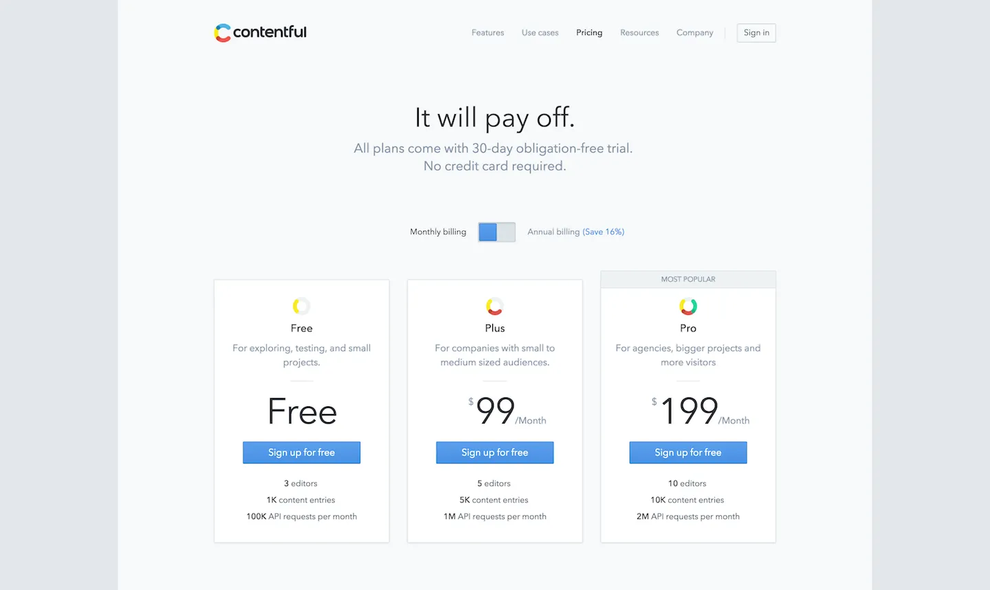
Key learning: Try actually indicating the type of customer you’re targeting, next to each plan on your pricing page. If you’re able to do this, it demonstrates that you have clearly well-defined plans targeted to real customer segments, and helps your potential customers understand which plan is likely to appeal to them.
2. Encourage MRR Expansion With Scalable Plans
Business customers can vary hugely in scale - from the bedroom startup with less than 20 active customers, to the global mega-corporation pulling in eight-figure MRR values. The cost for you to maintain each of these types of customer is quite clearly not going to be the same - you’ll incur a lot more in maintenance, infrastructure and support costs. Scalable pricing plans can be a good way to scale each plan with the size of the customer. Many companies scale based on:
- Number of internal users (e.g. number of agents for a support desk solution)
- Number of active customers (we do this at ChartMogul)
- Number of requests (e.g. an API-based service)
- Storage space used
Best example: Autopilot, with their useful scalable pricing slider:
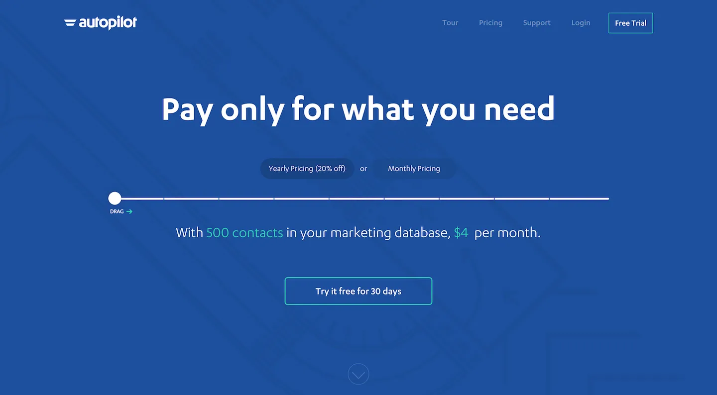
Key learning: Scalable pricing can be a valuable way to lower the barrier to entry for smaller customers, and to encourage steady MRR growth as your customers grow their business. However, you’re effectively introducing another dimension to the pricing of your product so the risk of confusion is much bigger. Make sure you can still communicate the pricing clearly and simply to your customers. (We solved this at ChartMogul similarly to Autopilot, with a nice interactive UI to allow customers to interact and experiment with each pricing variable involved).
A problem: Balancing scalable plans for B2B / B2C customers Let’s say you decide to offer scalable plans, based on the number of active users a customer has. You might have some customers who run a B2B business and have a few high value accounts. But what if you also have customers who are B2C businesses, with millions of low-value accounts? These guys will be paying a lot more, but won’t necessary be making any more in revenue! UPDATE: We've now discussed this issue in more depth in a recent post.
3. Free Plan vs. No Free Plan
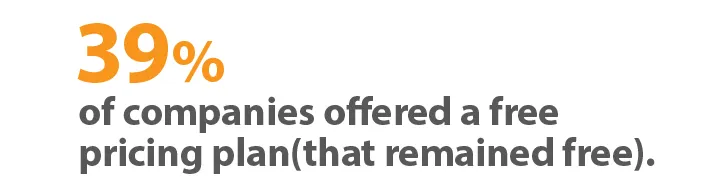
There’s a lot of debate in the B2B world around where offering a free plan is beneficial for your business or not. The answer to this is a decision that you need to take based on your product and business.
Benefits of a Free Plan:
- Drives adoption & traction for early businesses
- Gets users in the door, with the option of upgrading them at some point
- Nobody can argue with “Free”.
Downsides of a Free Plan:
- May attract the wrong type of customer (i.e. those that would have never paid)
- Devalues your product, makes the paid plans look expensive.
- The cost of maintaining Free accounts can become prohibitive.
Best example: Shopify - They don't offer a free plan, but cleverly show a cheaper "Starter" plan in a less conspicuous way on the page:
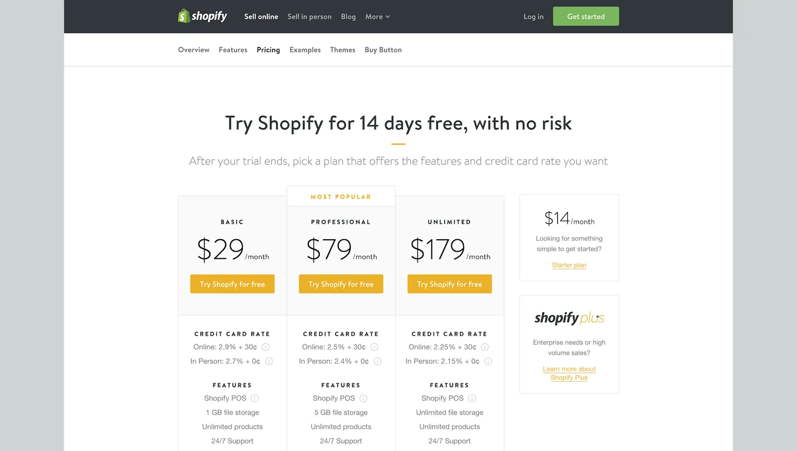
Key learning: Offering a free plan can definitely help boost adoption of your product, particularly if the product is “sticky” and you’re likely to upgrade those free accounts at some point. If you have one, consider not showing the free plan so prominently on your pricing page - then only the people who are really looking for it will find it.
4. The Inevitable Feature Comparison Table
Feature comparison tables can be incredibly useful, or they can be overwhelming, or in some cases completely useless. The reality is that a lot of B2B customers approach a product with a checklist of features they require - and a checklist of those exact points with big green check marks next to them can be a pretty compelling reason to subscribe. Things to avoid with feature comparisons:
- Including useless (obvious) features
- Making it huge (more than 20 items)
- Showing everything checked (seriously, some people do this).
Tips for a good feature comparison table:
- Make it optional (hide it behind a “compare features” link - it can end up just adding visual complexity that not everyone needs to see.
- Only list features you know your customers will care about (and differentiate your plans)
- If you really have to add a lot of items, try grouping them into topics to make them visually easier to navigate
Best example: Hubspot - Admittedly they have a reallylarge feature comparison table, but it's actually on a separate page, behind a "See all features" link:
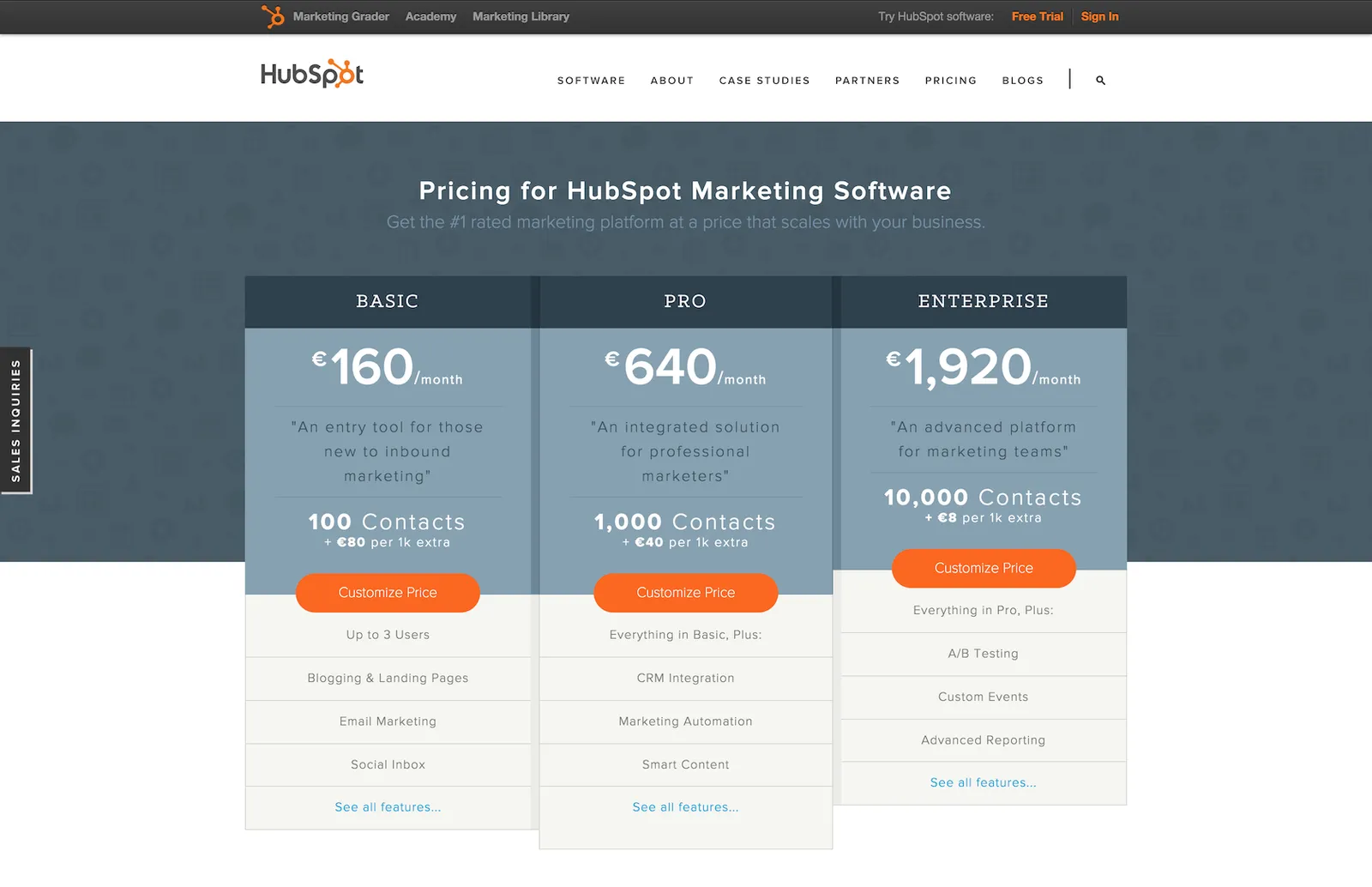
Key learning: Give a short summary of the really key features under each plan (max. 4 or 5). Make these ones the features that people will really care about and make decisions based on. Then offer a full list or table of features to compare versions, on a separate page or at least hidden by default.
5. Simplicity is King
Arguably the most important factor of any pricing page is to communicate your product’s pricing structure to potential customers in a way that’s clear and understandable. This requires two things:
- Don’t over-complicate your product’s pricing structure. You should almost always favour minimizing the number of variables and options over optimising for that tiny extra slice of expansion revenue.
- Focus on simplifying the design of your Pricing page. Iterate on the layout, and style - and test them!
Best example: MailChimp
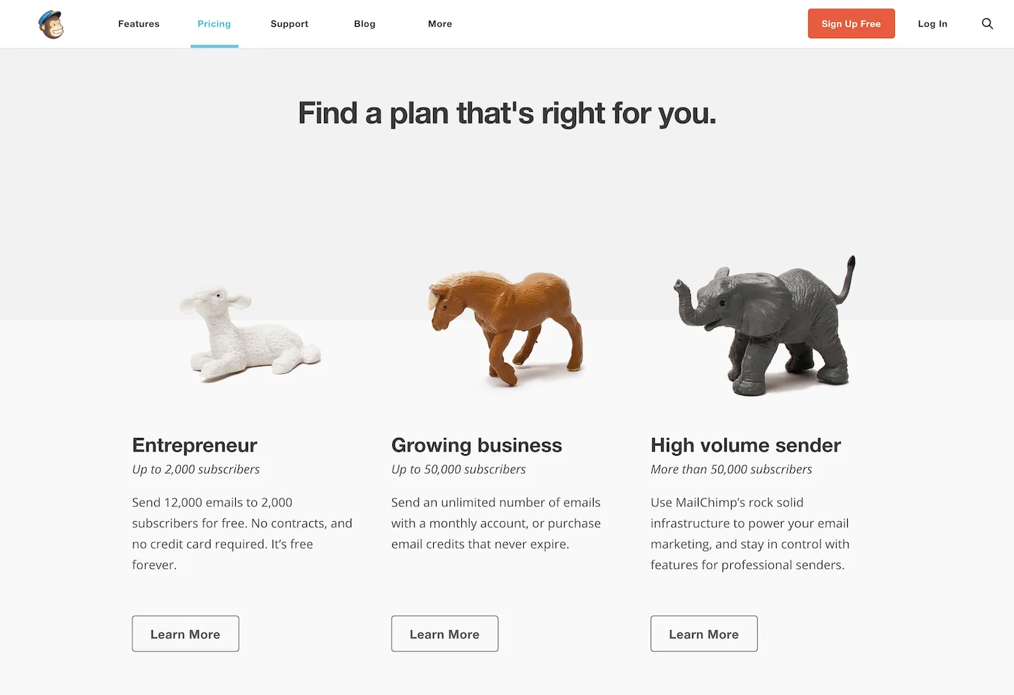
Design is something that’s always subjective, and fairly hard to quantify. But we felt that none of the other examples beat MailChimp’s offering, in terms of pure simplicity (both in the design and the actual pricing plans available).
Key learning: You may not be able to avoid having more complex pricing structures, feature comparisons etc. but why not think about hiding those from users unless they choose to view them? In doing this, MailChimp keeps its base pricing page (which is probably good enough for most users) insanely clean and simple, whilst still allowing the option to see more details.
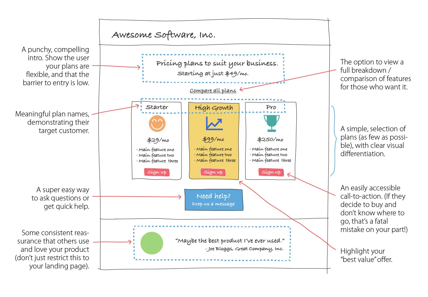
Common Components of a SaaS Pricing Page
There are a selection of elements you're likely to find on most pricing pages in the industry. Such page designs have been tested extensively for performance, and each component plays its part in giving the user the right information and guidance towards signing up for your product. Why not piggy-back on this existing research and testing, and use some (or all) of these elements in your own pricing page?
Follow and Share
Here's a Pinterest board with lots of high-res examples of the top #b2b #SaaS pricing pages: https://t.co/swRHntg3Sv pic.twitter.com/efF23QpwRP — Ed Shelley (@Mr_Ed) May 5, 2015