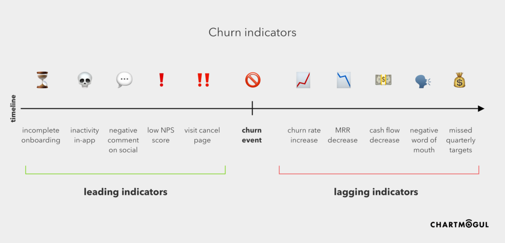
Leading and lagging indicators of churn
Every metric and measurement you have is measuring a specific snapshot — a single event in a long funnel. Every one of these snapshots can be useful when measuring your business, if you implement and use them for the right decisions. Depending on where the event happens in the timeline, we refer to it as a leading indicator or a lagging indicator.
- A leading indicator is an artefact that occurs ahead of the event. In the case of churn, it happens before the churn actually occurs.
- A lagging indicator is more of a side-effect – a measurable artefact that happens after the event. In the case of churn, it’s basically anything that we measure after the customer has churned.
Of course, when we’re talking about predicting (and preventing) churn, it’s useless to be looking at lagging indicators like revenue. We may be able to spot trends in churn by looking at churn rate over time — identifying a spike in churn rate can definitely suggest a problem that needs to be investigated. While this can be useful, it’s usually best to measure as far “up” the funnel as possible towards the earlier indicators of churn. However… there is a trade-off here. The further up the funnel you get, the less accurate the indicator.
Where lagging indicators are always 100% accurate (the even has already happened with 100% certainty), leading indicators can never be 100% accurate — with these we’re trying to predict or anticipate something that hasn’t yet happened. As an example, even if a customer visits the cancel page 20 times in quick succession, you can’t be 100% certain that they’ll churn (although it’s admittedly a very strong indication that they might).

Leading indicators for churn prediction
Clearly, when it comes to measuring churn indicators, there’s not much of a problem on the lagging side. Churn rate, MRR, cash flow etc. can all be measured and analyzed with tools (like ChartMogul!) to give you an accurate picture of the health your business.
Measuring leading indicators presents more of a challenge though — mainly because the metrics are so varied, and require different sources and types of data. Here are some relatively easy ways you can do this:
- Incomplete onboarding: You should have the data for this in your own back-end. You could either pull it from your database, or use a product analytics solution to gauge feature usage.
- Inactivity in-app: Tools like Intercom allow you to measure the activity of your users. They even provide a built-in segment labelled Slipping away that’s based on this kind of activity.
- Negative comment on social: Social media monitoring tools are your friend for this kind of data! Check out something like Agorapulse, Mention or Brand24.
- Low NPS score: This one’s the easiest to measure. Use whatever system you’re using for NPS surveys!
- Visit cancel page: Web analytics can work here, but you might struggle to identify the user with something like Google Analytics. Again, some product analytics solution such as Mixpanel can help you here.
If you looked through the measurement methods above, you can probably already see a problem with this approach. Each one requires a different data source, tool or type of measurement. Because of this, it’s not so easy to get some form of “churn risk” calculation in a single place.
Secondly, churn risk is not a binary measurement. The risk that a single customer will churn lies somewhere on a scale between 0 and 1. This means that it makes sense to build some kind of “certainty” score from more than one of these metrics.
Levelling up your leading indicators
Churn is hard to predict, but when you look at multiple indicators together, you can get a much more accurate prediction. For example, if a customer:
- Leaves a low NPS score
…you would probably put them at a moderate risk of churn. But the level of certainty is pretty low.
However, if you know that a customer:
- Leaves a low NPS score
- Visits the cancel page
- Never finished their onboarding
…I think you’d agree that the churn risk is much more certain, and much higher. In the case that these three things happen, we should really set off some loud alarm bells to investigate and find out what went wrong!
The problem
In a perfect world we’d have a constantly-updated churn risk score for every customer that’s based on metrics from across different web properties and social media. This enables a proactive approach to predicting and preventing churn, rather than reacting to limited signals when it’s already too late.
All the data exists for this, so what’s holding us back?
Given the different tools and systems involved, it’s hard to access and work with this data in any single place. We either need SaaS tools to get much better at talking to each other, or we need an all-in-one solution. At ChartMogul we love connecting systems using platforms like Zapier, but such a churn risk solution would planning and architecting, given the complexity and number of data sources involved. But imagine a world where we can build an automated churn risk score based on a combination of all the above data and more!
Over the next weeks I’ll be experimenting with methods for putting together my own Churn Prediction Machine, and I’ll share them with you here on the ChartMogul blog. Stay tuned!
Are you already solving this for your business? How do you predict churn? Let us know in the comments below — we’d love to get your input!
