
When I read Don Norman's book "The Design of Everyday Things", one of the key takeaways for me was the importance of taking into account the difference between how a tool has been designed to work and how a user thinks it works. Unsurprisingly, the more the two differ, the greater the chance the user will get frustrated or confused, even when the tool is working just as designed.
Such alignment issues are pervasive across products, be they ovens or web applications. A common solution is to make it clearer how the tool works so that users can update their mental models accordingly.
Because data in ChartMogul is built from the ground up — giving you both reliability and detail, our product is not immune to similar challenges. This can result in our analytics being less clear, and therefore harder to rely on.
We have discovered that clarifying the workings of our product, not only makes the data easier to understand, it can also lead to providing some further insights. This is neatly illustrated in a new improvement to one of our most popular functions, which is to filter your MRR by a specific plan.
Filtering by plan — how it has worked so far
Filtering your data down to a specific plan is great, as it can allow you to carry out price experimentation or identify which product offerings are driving most of your revenue.
However, it differs from most of our other filters, which segment the data depending on whether someone is a certain type of customer or not. This is a subtle but important difference, based on the fact that our filters essentially do two things:
- Select and aggregate the relevant data (e.g. total MRR shown on the chart)
- Select the relevant activities to be shown in the data table below the chart
What counts as relevant activities means that when plan filters are applied, the sum of the MRR movements shown in the data table below the chart will not always add up to the total MRR shown on the chart series.
Let's take the example where Jane purchased the Silver plan in January, and then the following month swapped it for the Gold plan. If you were to filter on a customer level (i.e. 'Jane'), you would see the MRR belonging to Jane, and the activities relevant to her. In this case, the total MRR is aligned with the movements.
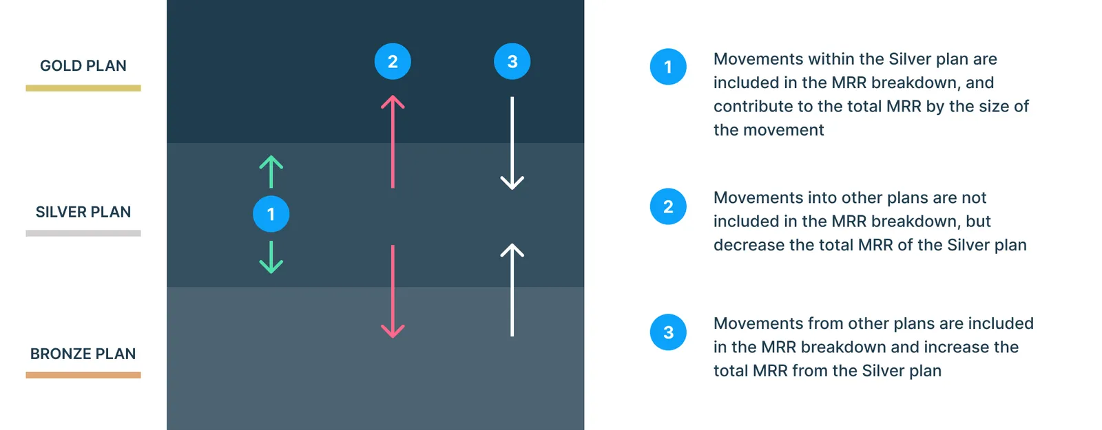
What counts and what doesn't when you use the plan filter functionality
However, if you were to filter the results by the Silver plan, you would get the total MRR for the Silver plan, but you would only see activities that switched customers to the Silver plan: you would not see the switch to the Gold plan in the breakdown, even though this still affects the total MRR of the Silver plan.
There is an additional subtlety. If on a future date Jane were to downgrade back to the Silver plan, this activity would show up in the MRR breakdown. However, it would be classed as a contraction of MRR (which indeed it is), but one which increases the total MRR of the Silver plan.
As we see, it can get complicated (and confusing) quickly.
There are therefore two problems. The first is clarity, in that it is not immediately clear as to why the numbers in the data table below the chart no longer add up when some of the plan filters are applied.
The second is that the breakdown provides an incomplete picture of the lifecycle of users with a specific plan. What happened to the users who switched away to other plans? Was their experience so positive that they upgraded to a more expensive plan, or was the opposite the case?
What has changed
Our approach was to add a new feature to the MRR breakdown data table below the charts to provide the information that was previously missing. We now include the value of the subscriptions that switched to the filtered plan, as well as the value of the subscriptions that switched out of the plan:
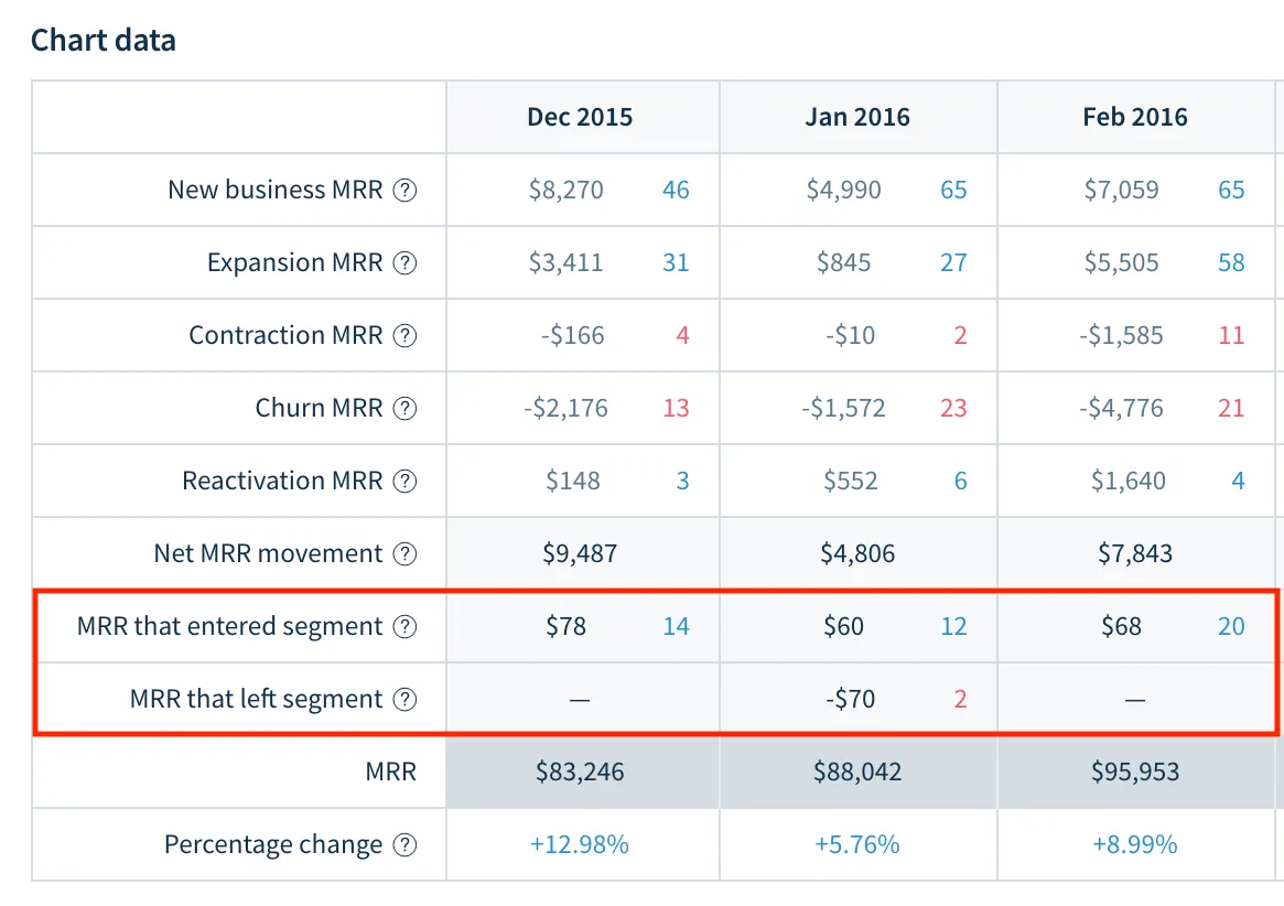
The MRR breakdown data table now includes new lines for MRR that entered and left the segment/plan
By doing so, the values in the breakdown will now add up to the total MRR. Selecting one of the cells, you will also be able to see the activities that resulted in the switch. If we were to think of the example above, Jane's expansion to the Gold plan would be seen among the MRR that left the segment, whereas her later downgrade to the Silver plan would be seen among the MRR that entered the segment.
Some benefits in practice
Providing better visibility of our numbers is good on its own, but there are some concrete use cases where this improvement can be very useful.
If you are a product manager owning a specific plan, identifying customers switching to it gives you a better understanding of the top of your conversion funnel.
Conversely, some of your customers may be 'leaving your segment', but by expanding to a more expensive one, i.e. an overall gain for the company.
With more companies having a 'land-and-expand' business model, this sort of insight can be crucial, as a growing product ecosystem can be lucrative (even if not without its challenges.)
Another example concerns monitoring transitions to and from annual plans. The guaranteed revenue of annual plans can be preferred over the higher rates obtained from monthly plans, even though this would result in a contraction of such customers' MRR.
By filtering by an annual plan, you will now be able to see see the size of the benefits such 'good' MRR contractions bring in terms of a more stable recurring revenue.
Better clarity, more insight
When we started working on clarifying the behavior of the plan filter, our main drive was to remove a source of perceived inaccuracy. However, by taking a step back to understand the source of the confusion, we also uncovered a new potential source of insights for our customers.
In that respect, building an analytics product is similar to tackling a math problem at school: it is good to show your work.