In the 1940s, Betty Crocker received 4,000 to 5,000 letters every day from women across the U.S. These women were looking for recipes, cooking tips, and someone to listen to their troubles. They poured their hearts out, telling her things that they wouldn’t tell their best friends. Betty would answer these letters on her radio program with kindness, good humor, and plenty of plugs for Gold Medal Flour.
There’s one small detail. Betty Crocker wasn’t a real person.

Betty Crocker was the invention of General Mills who was brought to life by copywriters, illustrators, and at least one very busy voiceover artist.
Betty wasn’t a brand mascot or advertising gimmick, she was the embodiment of a brand’s voice.
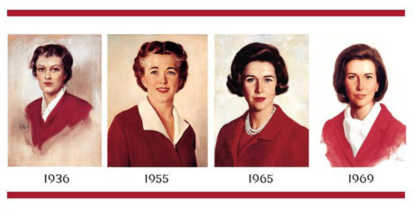

The success of Betty Crocker as a marketing mouthpiece was evident through those stacks of letters. If you’re sending a marketing personality a letter, even if you think she’s real, you’re one engaged customer. After all, when was the last time you sent a letter to Clippy telling him how your husband doesn’t appreciate all you do for him?
By allowing customers (or users, if you prefer) to interact directly with the Betty Crocker brand voice, General Mills fostered strong brand loyalty and a rich, active community around its products.
SaaS companies dedicate a lot of time and money to the same goal — they want to give customers a reason to stay and reduce churn.
Brand Voice is Critical to Brand Loyalty
Betty Crocker is just one studied instance of how brand voice can spur brand loyalty. Figuring out the personality of your brand’s voice is a fun exercise. In Betty’s case, it’s a warm and nurturing shoulder to cry on, who’s willing to listen to your most mundane problems and will reply with compassionate cheerfulness.
But no matter what that personality is for your brand, it’s consistency that counts for reducing customer churn. And in turn, customer retention is huge for profitability, with one study finding that “improving retention by just 5% results in a 25 to 95% increase in profit.”
Improving retention by just 5% results in a 25 to 95% increase in profit.
Tweet this quote
An anecdotal way to prove this rule is to think about the opposite. How would you feel if you suddenly got an email from Mailchimp addressed “Dear Sir or Madam”? Or opened up Microsoft’s website for its headlines to tout Teams as “On Fleek” and “Mad Sexy”?
Both of these brands have clearly defined audiences and voices — to see them communicate with different, inconsistent language would be jarring and suspicious.
Yet, it’s easy to find this kind of inconsistency with brands that do not have a well-defined voice, particularly when it comes to UX copy.
Because the power of consistency extends to what users experience when they open up a new piece of software or app for the first time. They’re looking for the same tone, personality, and excitement that they got from the marketing copy they first saw. They want to feel the same camaraderie with the cashier at the grocery store when they buy Gold Medal Flour that they felt when Betty Crocker answered their letter.
Luckily, that’s a lot easier to manage in a SaaS product than with a bag of flour. Let’s take a look at 2 examples from some of the leaders in the space.
HubSpot
For many SaaS companies, new users come in through a splashy landing page like this one from HubSpot.
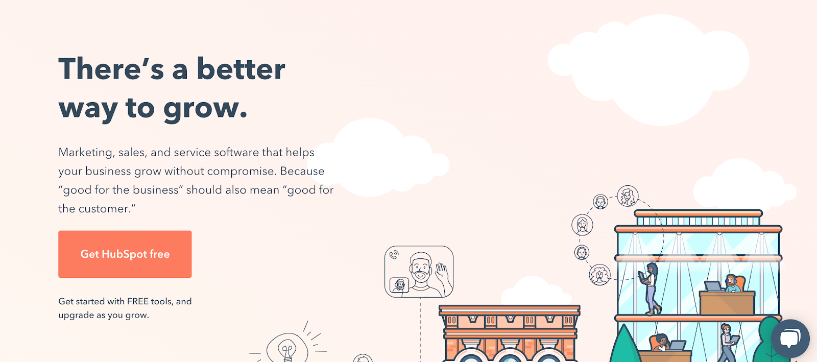
We’ve got all the markings of a conversion-optimized page — a snappy but clear headline followed by a focused value proposition and a big ol’ CTA button. The language is friendly and welcoming with cute, kinetic illustrations. How does this all fit within their brand voice?
With HubSpot, we have the benefit of their public brand voice guidelines, which tell us:
The HubSpot product voice is clear, helpful, human, and kind.
HubSpot Voice and Tone Guidelines
Funny how even this far-removed from Betty Crocker and her radio show, being “human” is still an ideal brands strive to achieve. The landing page copy here feels true to this established brand voice.
But what happens when I click that oh-so-enticing orange button?
When I click, I’m taken through a fairly standard account creation process that keeps the tone light and encouraging.
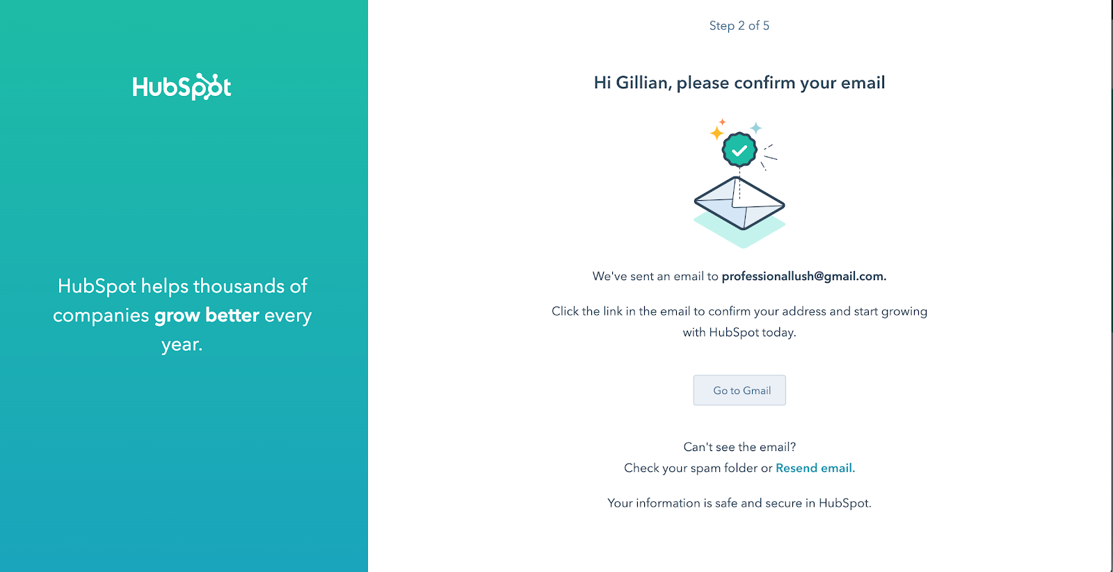
When I finally get into the app, HubSpot doesn’t drop their established tone or dump me into a complex app without holding my hand. They’ve made me feel welcome and comfortable and they don’t want to lose that trust.
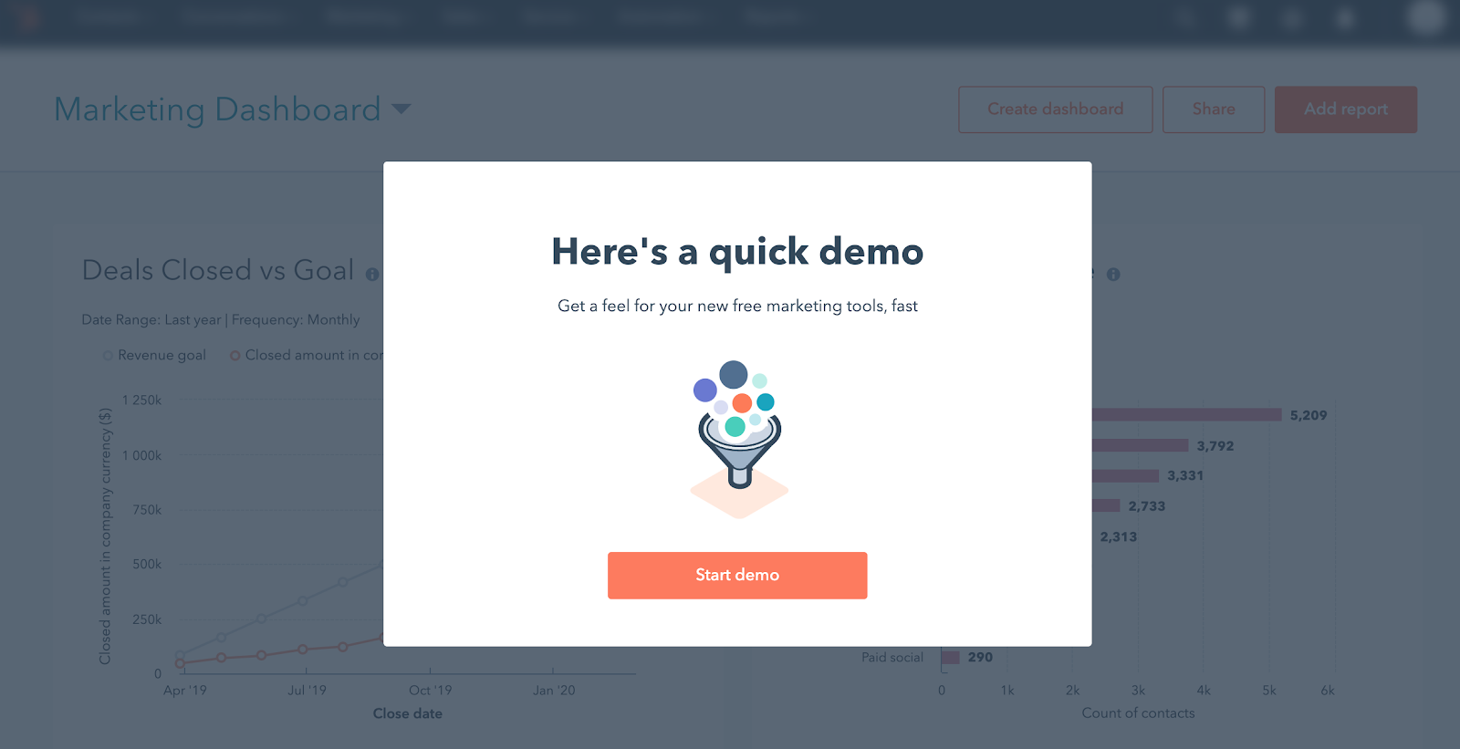
A demo or walkthrough is essential for a tool with this many features, but it’s “quick” and I’ll learn “fast,” two words that are both helpful and clear.
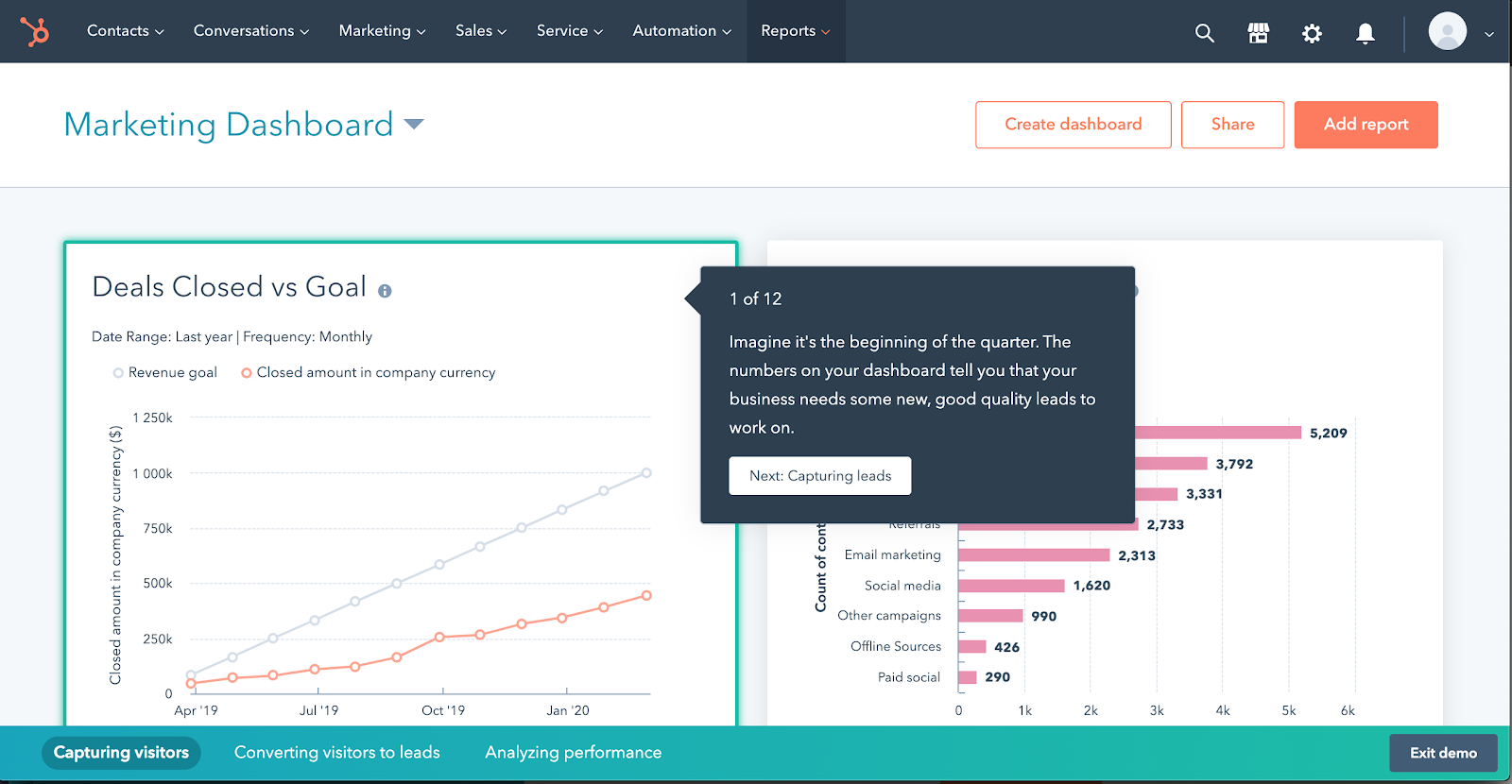
Once the demo launches, the copy within each step takes me and my business on an imaginary journey, explaining with clarity exactly when I would use a certain tool or feature within HubSpot. Not only is this a clever way to keep users engaged during onboarding copy, but it’s also extremely helpful and human, just like they’re aiming to be.
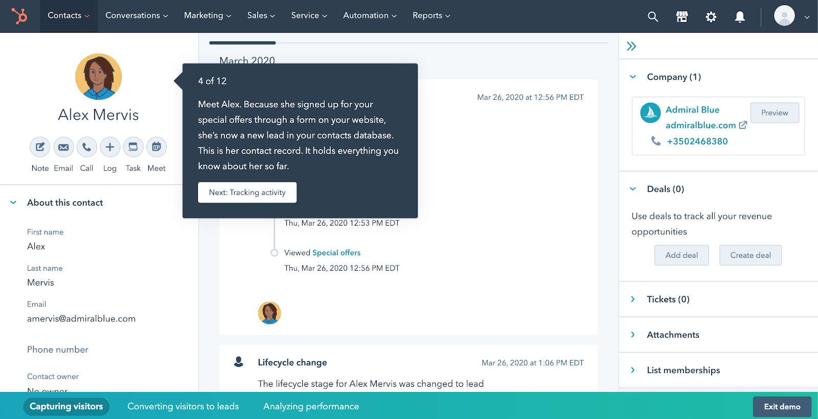
While 12 stops on an initial walkthrough are quite a lot, HubSpot knows that the more features they can introduce and get me to invest time into, the more likely I am to keep using their product. Because they don’t yet know where I will find the most value, they’re letting me explore a range of features and choose for myself.
HubSpot does a number of things right with their copy, but we’re here to talk about their brand voice consistency and it’s spot-on. I feel like I’m being guided through the app demo by a human being who cares about my business and wants to make sure I know how to use HubSpot.
By keeping up this brand voice throughout the onboarding process — while showing users exactly how to get the most out of the HubSpot tools — they’re going a long way towards new users wanting to stick around. Notice, they didn’t have to resort to an actual personification of the brand voice like Betty Crocker (or, god forbid, Clippy), they just had to use the right words.
Common UX Brand Voice Mistakes
If brand voice consistency is key in building out effective UX copy, it stands to reason that inconsistency is one of the biggest mistakes a company can make. And yet, it’s quite common.
Because different writers are often responsible for marketing and user-acquisition copy than those that write for UX copy that lives inside the software, it’s easy for voice to change if clear guidelines aren’t established.
Tweet this quote
Brand voice is something that is easier to put off than the design elements of a brand. You don’t technically need brand voice guidelines to launch a website but you need some kind of color and probably a logo.
However, division of duties is exactly why it’s critical to have a well-defined brand voice — one that’s written down somewhere and well-known by anyone that’s writing for you (in-house copywriters, freelancers, PR teams, whomever). A unified, defined brand voice that applies across a platform and its marketing messages gives a company a better chance of delivering on its marketing promises and therefore retaining users.
Accelo
Accelo is a ServOps platform that lets businesses doing client work and billing for time automate various tasks. It integrates with other applications like Google and Microsoft Exchange to streamline client service operations.
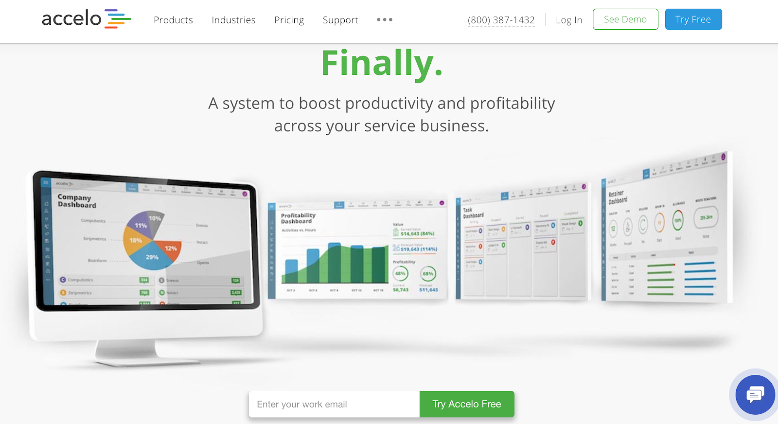
Setting aside a bit of the vagueness in the Accelo landing page copy, the tone of the copy is fairly clear. This tool is all about productivity and letting your business get more done in less time. Luckily, Accelo has published their brand voice guidelines, too.
Our brand voice is authentic, ambitious, and personal.
Accelo Brand Voice
Once you go through the account creation process for Accelo, the first thing that happens is you’re invited to schedule a call with someone on (presumably) their customer success team.
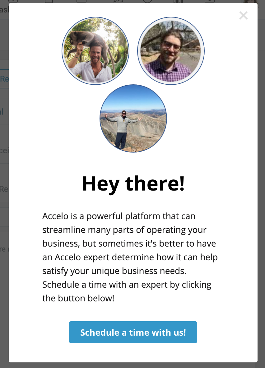
Setting aside (again) the fact that I personally don’t want to talk on the phone, if I can help it, the tone of the copy in this pop up is a bit frantic. In just about 50 words, there are three exclamation points. An exclamation point, unfortunately, isn’t a shortcut to a personal or friendly tone. And three of them is, well, it’s a lot and it conveys the opposite of what the Accelo brand voice purports to want — it feels inauthentic. To be honest, I already want to run away a little bit.
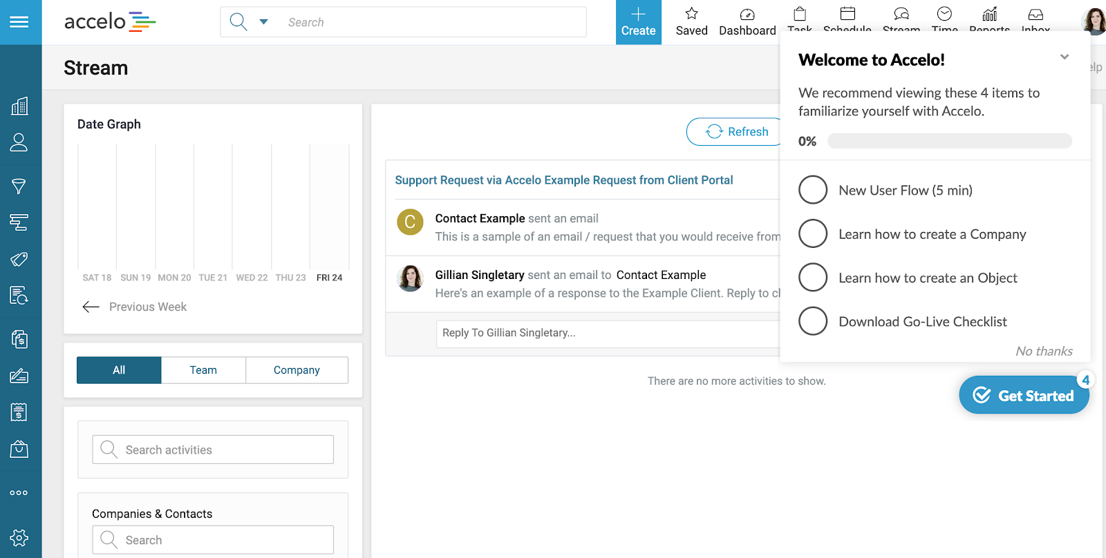
If you decline to schedule a phone call (from my experience they’ll call you anyway, but that’s a separate issue), you’ll be greeted with another exclamation mark and a suggestion that you familiarize yourself with four different areas of the tool. The New User Flow will only take five minutes, but there’s no telling how long the other three will take.
I can understand the impulse not to tell users what to do, but we recommend viewing these 4 items does not convey ambition, authenticity, or personalness to me.
I was required to enter details about my business — like the number of employees and industry — during the account creation process, why not use that to personalize the tour then?
Why not repeat some of the benefits to my business that will help me harness my own ambition? Now that I’m inside the app, how is Accelo going to deliver on its landing page promise of boosting productivity and profitability? Ideally, this would be clear right away since it’s what was sold to me upfront.
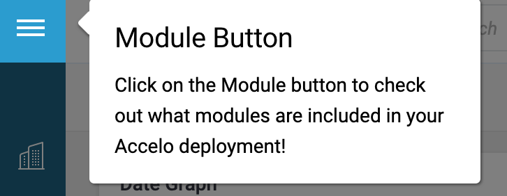
If you decide to go through the recommended list of items, don’t worry, you’ll still get exclamation marks. But more importantly, the pop-ups that are supposed to teach you about the tool just don’t. This one invites me to check out what modules are included in my deployment. I don’t know what a module is and I’m confused about why they’re calling my account a deployment. As inVision writer Patrick Stafford notes, “People aren’t bothered so much by length, but by lack of context,” and this tiny UX blurb gives zero context.
There’s a weak argument to be made that the word “deployment” falls into the ambitious ideal of the brand voice guidelines — a deployment sounds slightly more ambitious than account, but with no context or explanation, it merely invites confusion.
This is an example of a brand’s copywriting failing to take into account what knowledge a new user is coming in with. Surely whoever has written the UX copy within the Accelo tool is intimately familiar with how the tool works and what each of the features is called. But I’m not. It’s my first time. I don’t know what a module is. I don’t know what a deployment is. And as a new user, I shouldn’t have to try to guess.
I don’t mean to be overly harsh on Accelo. I didn’t try to use the tool for my business, it may work extremely well. But the UX copy throughout the onboarding process was not only inconsistent with the brand voice they purport to adhere to, it was also confusing at every turn.
The more time I have to spend trying to figure out the basics of the tool, the more likely I am to leave and never come back. As Eric Keating from Appcues puts it:
App stickiness evolves from feature adoption. If a user only uses your app for one thing, you’re easily replaceable. But if you become the go-to for multiple tasks (think: Slack), you become more ingrained in a user’s day-to-day life and, thus, they would be less likely to churn.
How am I supposed to adopt any features if I don’t know how to use them or what they do?
It’s difficult to find alignment between what Accelo meant to accomplish with their brand voice guidelines and the copy they’ve chosen to use. Indeed, it may be useful to expand on those guidelines to include some language that speaks to usability. Adding even a word or two about clarity or helpfulness (and then doing some rewrites) could make a huge difference.
How to Up Your UX Brand Voice Game
A consistent, enticing brand voice that carries through your UX copy is a lever you can pull to reduce customer churn. By making new users feel comfortable, welcome, and understood, you increase the likelihood that they will engage with your service and stay.
If you’re not doing this already, there are a few ways to get started on both establishing a clear and consistent brand voice and utilizing it effectively for your UX copy.
Write it Down
No matter how clear your brand voice is to you, no matter how few employees or writers you have working for you, your brand voice guidelines need to be explicit and need to be in writing. A simple sentence like we saw from both HubSpot and Accelo is enough. Three or four adjectives can go a long way towards keeping your copy consistent.
Of course, it’s not enough to have clear brand voice guidelines, you also have to make sure that people are referring back to them before they write copy for your marketing materials, site, or app.
Audit User Flows, Starting with Marketing
If you’re constantly clicking through your user flows to see where you need to move a button or change a font size but you’re not addressing the copy itself within your software, that’s a problem. To stem the outflow of new users, familiarize yourself with how those people get to your site and what they do next, all the way through their first touches within your app. Pay attention to the messages they’re getting. Are they consistent? Are they clear? Do they feel understood, cared for, and safe enough to send you a letter about how much their husband hates their cookies? If not, how can you make it so they do?
Note, this process should include user testing. As technical writer Tom Johnson says astutely:
Familiarity is one of the main things that get in the way of clarity
Tweet this quote
You’ll never really know how clear your copy is to brand new users unless you get input from people who are not familiar with your product.
Good copy can help reduce customer churn
You already know that harping on features in your marketing copy is less effective than conveying your product’s benefits to your potential customers. People want to know how your product will improve their lives and their businesses.
It’s no different when you get into your UX copy, but now you have a chance to add a lot more context. Use your product walkthrough (just having one can improve conversions by 20 to 100% according to InVision) to show new users exactly how they can use each of your features to add the value that they promised. As Katryna Balboni puts it in another Appcues blog,
Customers churn when they don’t achieve value. Every SaaS company is different, and every subscriber has different needs, but customer churn always comes back to the same root cause: Customers churn when they don’t achieve their desired outcome.
Use your copy to get them to value faster and you’ll get them to stay.
It’s worth the time and effort to establish a brand voice that’s not just clear, but that feels helpful and personal, like a letter from you pal Betty Crocker.
Then, make time to continually evaluate your UX copy for consistency with the voice you’ve developed. It’s not zero effort, but as you improve your customer retention, you’ll have more consistent revenue that will let you make the other updates and changes you’ve been putting off in the name of demand generation. Spend the time to keep the customers you have and you’ll eventually be able to grow much more efficiently.
About the author:
Gillian Singletary is a conversion copywriter and founder of Large Potatoes, a copy agency for big deal brands.
