THERE’S A NEW VERSION OF THIS ARTICLE!
We’ve published a new 2017 analysis of SaaS landing pages — This year we’ve expanded to over 100 companies — it’s packed with more insights than we’ve ever published in one article.
Check out the new analysis here:
SaaS landing pages in 2017: Our analysis of 100+ top businesses
For this analysis, we scoured over 40 landing pages across the web. It’s clear that web design standards and best practices, as well as advanced optimization techniques, are leading to conformity of most standard elements. However, business websites still need a way to stand out, and to market the product in new and inventive ways to the user.
View the landing pages
Follow Ed’s board Top SaaS Landing Pages on Pinterest.
Elements of a SaaS landing page
1. Site navigation
Obviously fairly essential, the navigation allows the users to get around your site. Things to consider here include:
- How prominent does it need to be? Users should be able to find it when they want it, but making it the most stand-out part of the page may draw their attention away from actually reading your content.
- Simplicity is king! An overly-complex site navigation will leave your visitors confused like a tourist in a city without a map.
- Does it always need to be visible? Consider hiding it at points when the user will be browsing your page content.
Example: SendGrid

Example: Vend

What did we learn?
Although a navigation menu might seem like a fairly standard element in any company’s website, there are things you can do here to guide the user through your site’s content in the most natural way for them. Think about:
- Scrolling vs. Clicking. Scrolling is perfectly natural – usually more-so than clicking through menus. And it requires fewer page loads.
- As highlighted in the examples above, keep your navigation clean if necessary by hiding secondary items.
- Remember that existing customers will land on your homepage too – don’t make it difficult for them to log in to your app!

2. Hero shot
This is the single image (or video) that grabs the attention of your user, and entices them to read more about your product. Quite often this will be a full-width large image, that takes up most of the visible screen. The hero shot has emerged as the leading element of landing pages in recent years, with high speed internet allowing for large, high-resolution images showcasing the product in a much better way than words ever could.
Example: Contentful
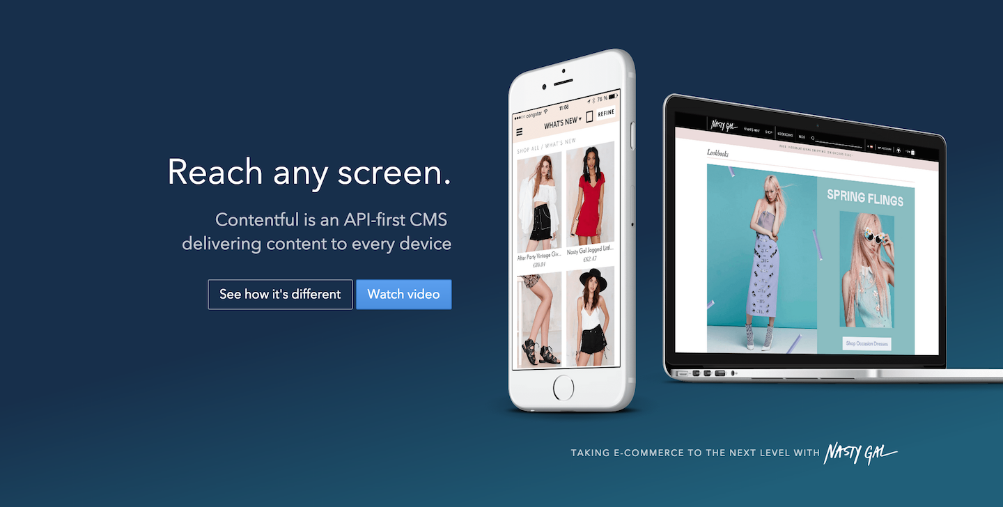
Example: Google Apps for Business
There is a huge amount of psychology behind imagery on websites, and how the user is affected by colors, different styles, faces etc. I asked our design / front-end expert at ChartMogul for some input on hero images and the inclusion of people:
“It’s important to make clear who we’re designing & building for, showing we’re putting real people first, not some technology. And generally humans react more intensely to faces than a product screenshot.”
What did we learn?
- You don’t have many seconds to capture the attention of a visitor. It’s got to be visually striking or highly appealing to succeed.
- Full-page video is just about feasible, given today’s standards for high-speed internet and powerful browsers.
- If your product is not very visual, why not leverage what your customers do with the product?

3. Your product’s USP
The USP is your unique selling proposition. It describes in the most concise way possible what your product is about – and persuades your visitor to continue browsing.
Example: Huddle

Example: Intercom

What did we learn?
- Most companies use a one-liner, followed by a subtitle of 1-2 sentences.
- If you can’t get to a simple one-liner, think on a higher level about what your product solves. The Intercom USP above is a great example of this.
- Avoid using elaborate adjectives or adverbs here. This is not the sentence that sells your product, it’s simply to pique the interest of the visitor.
- Bad: “Critical customer communication with effortless simplicity and beautiful effectiveness.”
- Good: “Customer communication made simple.”

4. Product benefits
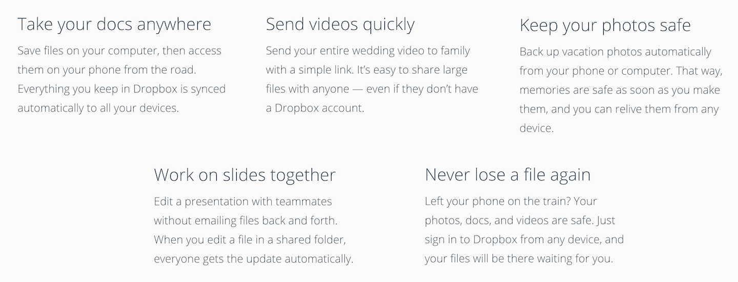
What will the customer get by signing up for your product? A list often works well here. NOTE: The temptation with this is to gravitate towards listing the features that your product offers, i.e. “20GB cloud storage”. This is not a benefit, and is not compelling. How about “access all your files from anywhere”? That’s a benefit, and the visitor can identify with it, and understand how it improves their life. As the folks at User Onboarding put very eloquently:
“People don’t buy products; they buy better versions of themselves.” – Samuel Hulick, User Onboarding
Example: Geckoboard

Example: Dropbox
What did we learn?
- Show benefits not features (mentioned above). There is a place for feature lists on your site, especially with more enterprise-focused products (those customers will often evaluate your product with their own list of features that they require) but that’s not for your landing page – try the Pricing page.
- Icons can nicely compliment the features you list here, and give an even quicker impression of the benefits you’re offering to customers (see the Geckoboard example above).
- Descriptions should still be kept brief, but linking through to a product page for a more detailed overview of the features can also be helpful.
5. Call to action (CTA)
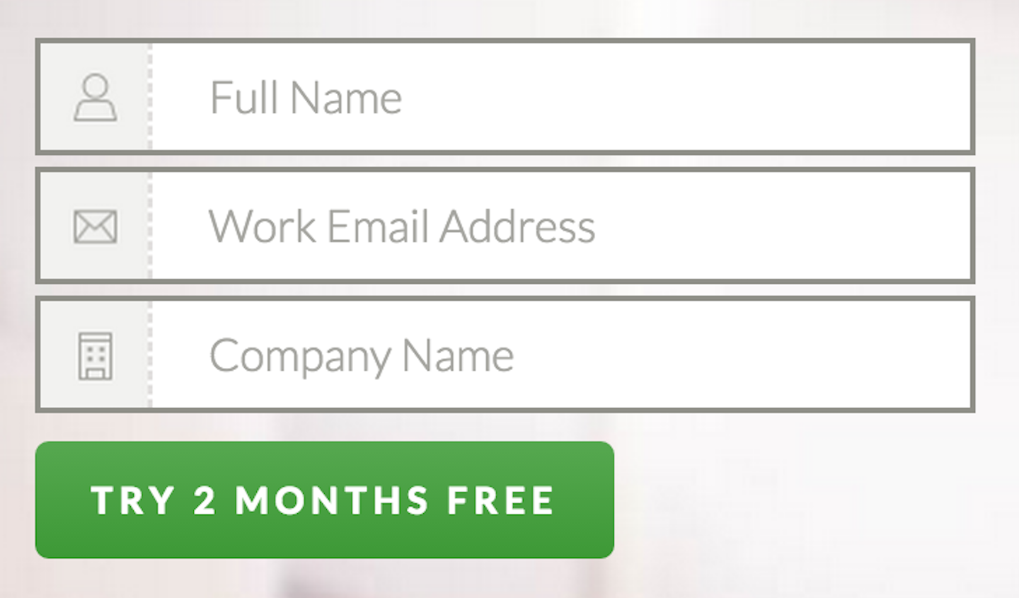
This can include a signup form, or simply a button, and is the primary goal of the landing page. A key goal here is to have a single call to action on the page. Multiple CTAs make it less clear for the visitor and risk clouding the powerful message you’re conveying. Multiple options = lower conversion.
Example: Freshbooks

Example: Zenpayroll
What did we learn?
- Be explicit with the copy. Make sure that a visitor knows what they’re doing when they click the button, to reduce the rate of “accidental” clicks. You want users to click with full intention.
- Put it where the user expects. Unbounce have written many great guides on this, as well as other CTA optimization tips. For example, using “my” instead of “your” (i.e. “Start my free trial”) converted 90% higher for them!
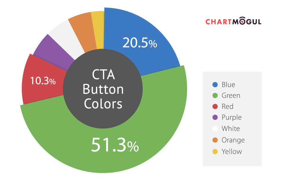
- The vast majority of CTA buttons in the landing pages we looked at are green.
6. Social proof
This is really important in giving the visitor that extra piece of confidence required for them to vote with their mouse pointer and sign up to your service. There’s no more powerful persuasion tool than personal recommendation, from real people. If visitors can see that others are successfully using your product, they’re much more likely to come onboard themselves.
Example: Docusign
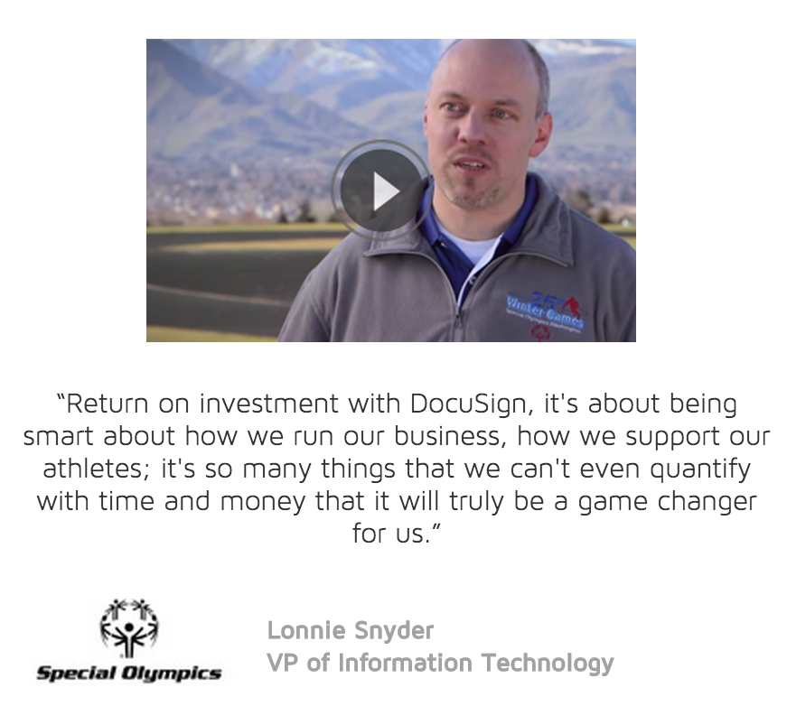
Example: ChartMogul (yep, that’s us)

What did we learn?
- Showing real people, with real profiles has become key in a world where some companies actually create false social proof.
- Placing social proof at the point on the page where the user is making a decision about purchasing (or registering) is a good tactic in giving them that last reassurance they need to commit.
- Link your social proof to larger case studies or video. This will further boost users’ confidence in the product.

Other Findings
Attention Ratio
As always, simplicity is king. The challenge with so many enterprise business websites is in distilling down what are hugely complex products and solutions into something that the user can interpret and evaluate in just a few seconds. Attention Ratio is a representation of how many links the user has the option to click on your landing page vs. the primary conversion goal (i.e. a trial sign-up). Whilst you’re never going to achieve the holy grail of a 1:1 ratio on your main company landing page, you should remember that every link the user can click other than the signup CTA is giving them a “way out” of converting. Read about the concept of Attention Ratio on the Unbounce blog – and then take a look at your landing page. What’s the attention ratio there?
Page Length
The length (or height) of a landing page has a large impact on how the user behaves on the page. If the user needs to scroll a certain amount to see some critical information, it’s likely that you’ll lose a certain proportion of visitors before they read it. However, you shouldn’t dismiss scrolling as a bad thing – research suggests that scrolling has become a natural interaction on the web that users almost instinctively take when they want to read more on a certain topic. So then the question here is more about the layout of information, such that the things that are really important for the user to see are positioned higher up, with little to no scrolling. The landing pages we analyzed were a variety of lengths. At the extreme end, there is Mailchimp, which requires almost no scrolling at all and offers a level of simplicity that almost no other SaaS company matches:
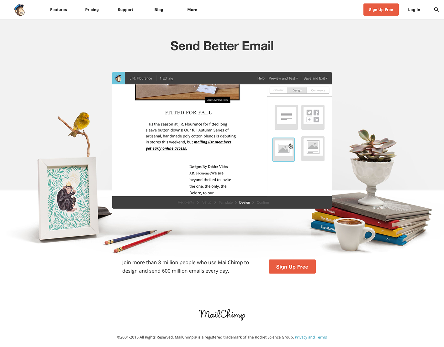
Whilst Mailchimp gives us a glimpse of a landing page that delivers a clear, concise message to visitors, most landing pages required around 4 full page scrolls to reach the end. You can see an overview of the length of all pages in the diagram below: 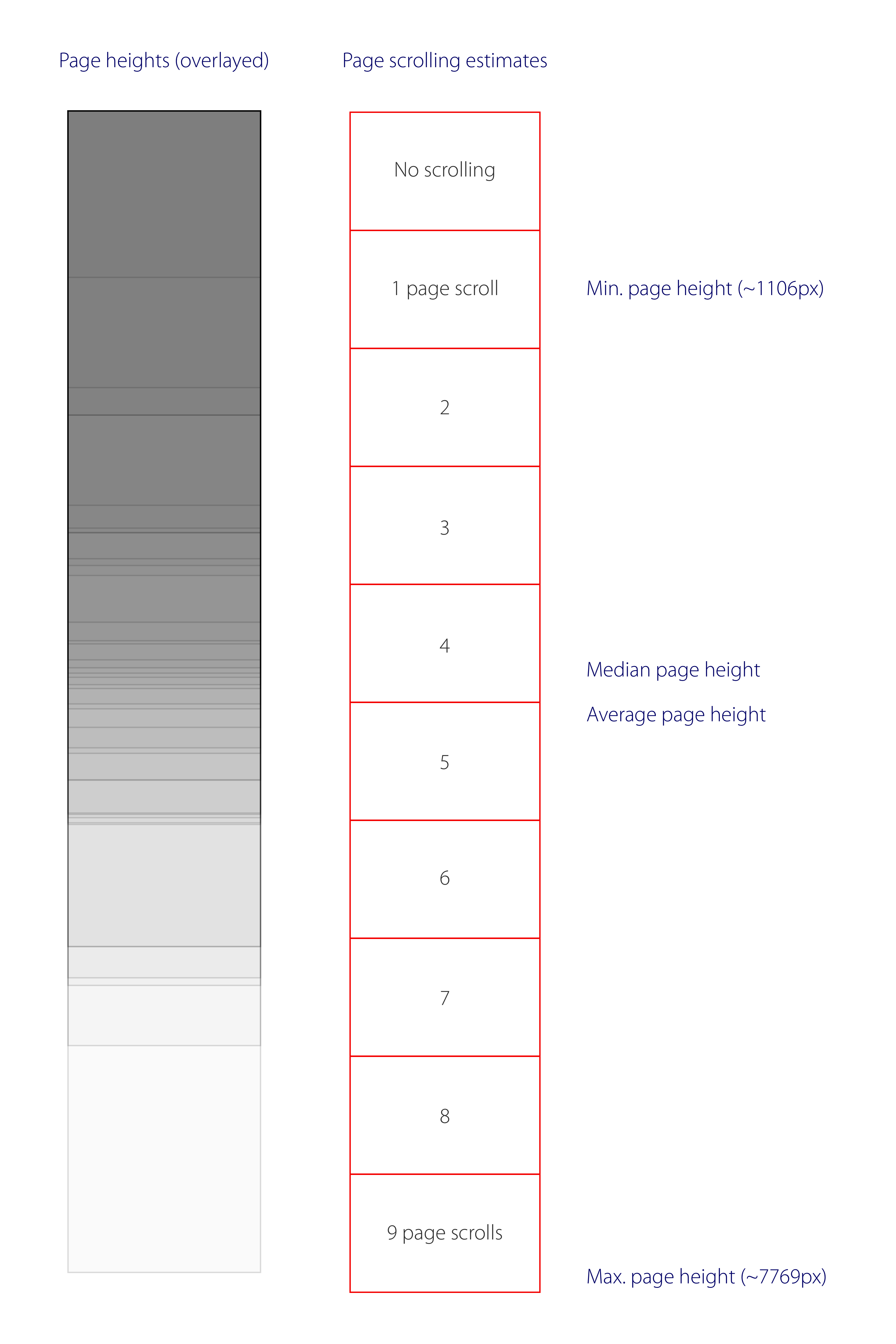
Animation & background video
Technology and connectivity is reaching a point where websites are able to display high-resolution, full-page video embedded in the page. See an example here. Whilst the rise of full-width retina images have led to higher engagement and conversions in web pages, it’s not yet clear whether full-width auto-playing video background takes this improvement even further. The folks at LeadPages recently introduced a video background landing-page template, hinting at great conversion rates. Although it’s likely very specific to the actual video content shown:
“One of the reasons why this works so well is that the video being used is aspirational and makes people feel really good.” – Jeff Wenberg, Leadpages
We’re testing a background video variant of the ChartMogul landing page, but it’s too early yet to pull any meaningful results.
Share this post
NEW on @ChartMogul: What we learned analyzing 40+ top #SaaS landing pages http://t.co/6j1dd10nYW pic.twitter.com/TwvwDx58MZ — ChartMogul (@ChartMogul) September 2, 2015
