Why SaaS Pricing pages are fascinating
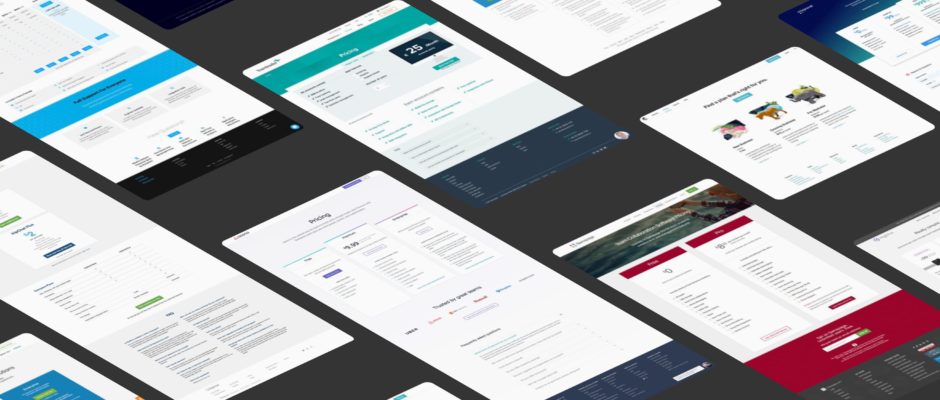
Pricing pages are a rare window into a SaaS business’s strategy. It’s often the single part of a B2B site that deals in pure facts. Where other landing pages and product info pages are driven by fuzzy information like value and benefit (both of which are important), on the pricing page there’s no escaping the facts.
“Pricing pages are a rare window into a business’s strategy.”
Despite this (or maybe because of this), the presentation of a pricing page can make or break the effective ability of a website to generate signups. The majority of SaaS businesses today rely on “self-service” signup flows, meaning that there’s no human involved in the process. The website is your sales rep in this case, and the Pricing page is often the final hurdle to a conversion.
Every business should care about how they communicate the information on their Pricing page, and looking to others for inspiration is a great place to start. That’s why for the second time, we’ve compiled a giant analysis of top pricing pages in the SaaS industry.
Our 2015 analysis remains one of our most popular posts of all time. This time round, it’s over double the size, covering more than 100 businesses!
We’re covering businesses representing a large range of SaaS industry verticals:
- Billing & Finance 10.5%
- Business Intelligence 6.1%
- Commerce 2.6%
- Communication 7.9%
- CRM 14.9%
- Design 4.4%
- Dev & Infrastructure 11.4%
- HR Management 10.5%
- Marketing 9.6%
- Office Management 1.8%
- Project Management 13.2%
- Sales 3.5%
- Other 3.5%
View the pages
As always, you can view the full-length pricing page screenshots in this pinterest board. This alone serves as a great resource for your own inspiration – have a browse yourself!
Our findings
Below you can find a breakdown of the insights and findings in this year’s analysis. Pricing pages contain several key elements, and it made sense to look in detail at each of these elements one by one. You’ll also find hand-picked examples for each of the elements, from the set of pages we analyzed. Let’s dig in!
Side-note: The examples included in this post are not necessarily what we consider the “best” or “winner” of any specific category — they’re interesting examples of the concepts and elements we’re discussing. This is not an awards ceremony ;)
Part 1: The Headline
If we’re in agreement that the pricing page is critical, the headline is the critical part of the pricing page. Usually located in the “Hero” section, it’s the first thing visitors will fix their eyes on before they inevitably scroll down to look at your offering.
The job of the headline in this not to communicate any specific information as such — rather to set the tone and emotion of the page (yes, emotion is always involved), and to make sure it reflects your brand values. Looking at the 100+ headlines in this analysis, the language used is surprisingly similar, based around the core values of:
- Flexibility
- Choice
- Simplicity
- Fitting your (the visitor’s) needs
- Affordability
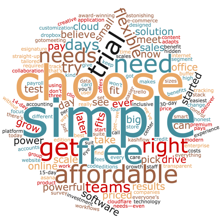
If you had to create a single generic headline that was the average of all included in the analysis, it would be something like:
“Our pricing is flexible: Choose a simple, affordable plan that fits your needs.”
(I don’t recommend using this one, it’s too generic and not very good.)
It’s all about the language
One of the easiest ways to get a high-level impression of the language used in these headlines is with a word cloud. Here, we’ve removed some “stop” words (‘a’, ‘the’, brand names etc.) and what’s left is a good indication of the general sentiment of pricing pages:
What we learned
- Conveying the right emotion and tone is more important here than useful or actionable information. It sets up the entire page.
- Keep it short (the vast majority are less than 7 words).
- You can also use this to reinforce your brand values – great for consistency across your site.
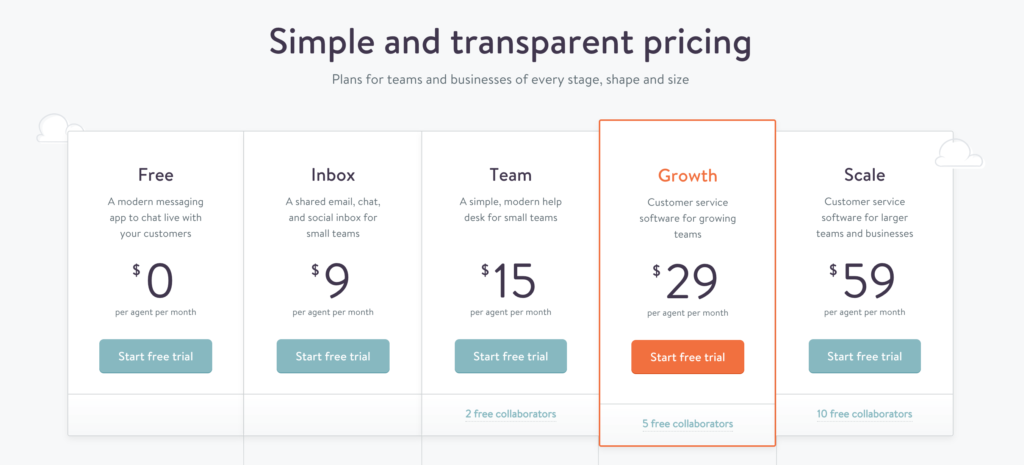
Example: Kayako, for the feeling of flexibility and simplicity
The folks at Kayako have done a great job of designing a pricing page that inspires confidence in the visitor. The language on the page — particularly the headline — reinforces and encourages people that they’re not being tricked in any way (transparency) and no matter what your business looks like, they have something for you (flexibility):
Part 2: Monthly vs. Annual billing
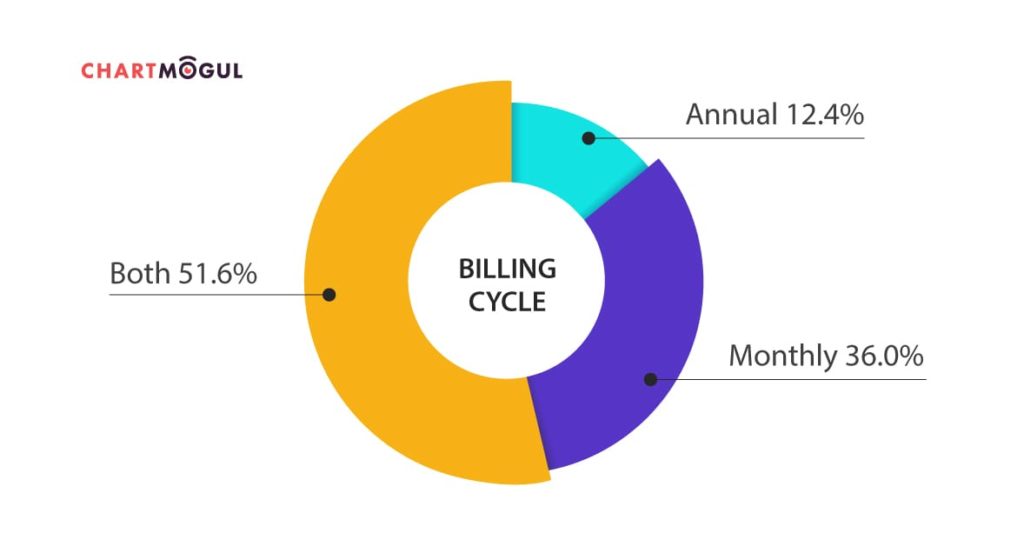
Should you bill your customers on a monthly or annual basis? Both have benefits and drawbacks.
Monthly billing:
- Requires less up-front commitment from customers (lower friction to buy)
- Allows you to effectively analyze metrics like churn rate
- Suits a self-service signup flow
Annual billing:
- Increases cashflow
- Can make revenue metrics more difficult
- Can reduce churn
- May need a higher-touch Sales and Support approach
What we learned
- Think carefully about defaults, and their impact.
- Don’t feel that you have to offer both monthly and annual plans — many don’t.
- Annual plans usually need some discount incentive over monthly (e.g. 1 month free).
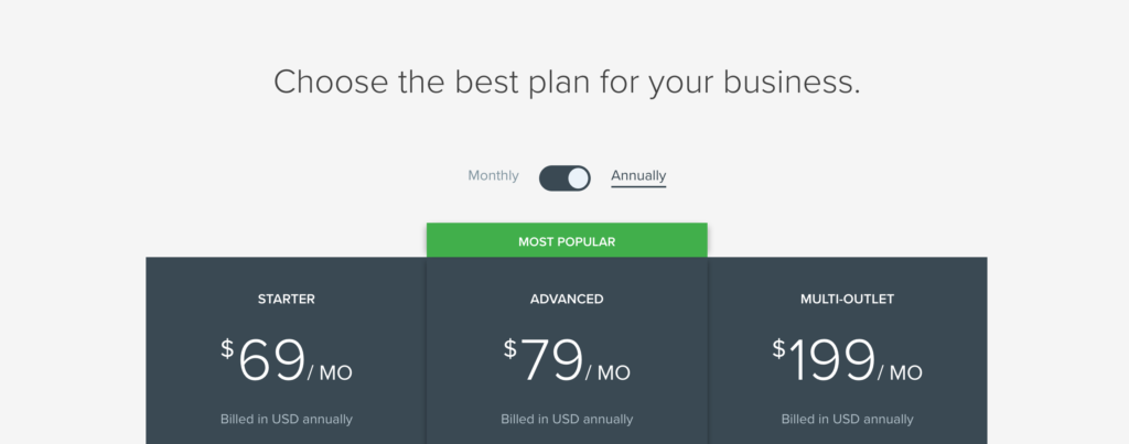
Example 1: Vend, for the classic ‘toggle’ switch
The toggle switch has become the most common UI implementation of presenting both monthly and annual pricing to the visitor. The benefit of using this today is that it’s almost an expectation from visitors that they’ll find this (or something very similar) on your page.
The more interesting decision to make here, given that you want to offer both annual and monthly pricing, is which option to make default:
- Default to monthly: Your prices look lower (the numbers are smaller) but more customers on monthly plans could mean greater churn risk.
- Default to annual: The prices look higher, but you’re nudging users towards a bigger revenue commitment.
Example 2: Leadpages, for offering a 2-year plan
I’d love to know the thinking behind adding the Leadpages 2-year plan. On the surface, it might seem like an odd choice — it could be that the LeadPages team had committed, satisfied customers who were more than happy to buy in to a longer term. Plus, they save even more over a monthly plan – 46%!
On the flip side, this could be a case of Price Anchoring. The 2-year plan may work from a psychological perspective to make the Annual plan seem less of a commitment, and therefore drive increase Annual signups.
Price Anchoring exists everywhere on the web, especially in SaaS where every small impact is measurable. Read more about it in this mint.com explainer. Is it something you should implement on your own pricing page? That’s a decision you need to make.

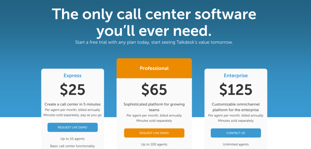
Example 3: Talkdesk, for not even mentioning the billing period
This move from Talkdesk highlights just how much information is assumed by the user on modern websites. When you’ve evaluated enough SaaS products, you’re quite aware that nearly all of them show monthly pricing (unless there’s a separate annual option). So they don’t even show the billing period.
Secondly, Talkdesk really pushes visitors towards a live demo or sales call, suggesting that pricing is discussed in more detail through this process (it’s not as important to be explicit here). For a predominantly self-serve signup, this strategy would still be a little risky.
Part 3: Pricing tiers
You may feel like the presentation and layout of SaaS pricing plans has converged on a single, un-interesting design. Everyone knows and recognizes the “3 column” style. But surprisingly, there’s room for numerous small optimizations and innovation here — as you’ll see in the examples!
The goal of this section is to present the different pricing plans for your product in a simple, understandable way. However, under the surface most businesses are using psychology to get you to spend that little bit more – with strategies for emphasizing (or de-emphasizing) certain elements.
What we learned
- The “expected” design works for a reason. It’s often advisable to stick to Good, Better, Best – unless you’re targeting a large number of different personas.
- Be creative when emphasising your “preferred” plan – see the examples below.
- State who the plan is for! There’s no reason not to do this.
- This can also be aspirational – visitors will buy the plan that corresponds what they want to be.
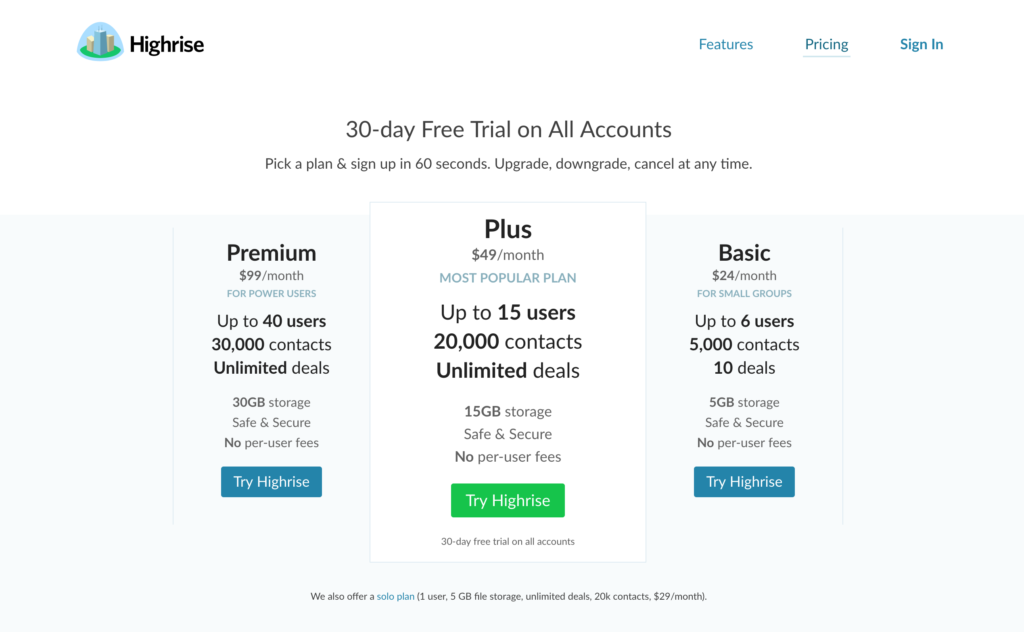
Example: Highrise, for reversing the order
Good – Better – Best. We always expect this order when looking at pricing options – because in 99% of cases this is how it’s presented. The Highrise team decided to reverse this though. Why would they do this?
They want you to see the Premium (best) plan first. In the Western world at least, we always read from left to right. So put the Premium plan on the left! Doing this is not an act of trickery – I don’t think they expect you to “accidentally” sign up for the Premium plan. It’s more about where you put your attention first.
Geckoboard, for being clear about each plan’s target customer
We mentioned this in our 2015 pricing analysis, but it seems to be an even stronger trend this time round – which I consider a good thing! Generally, pricing plans should be designed for a specific type of business. If you’re offering your product at ‘Price Point X’, it should be because there’s a specific type of customer you have in mind who will willingly buy at that price point.
When it comes to the pricing page, you can make this even clearer by actually communicating the target customer for each plan. You’re basically saying “if you fit these criteria, this is the plan for you – so buy it.” Geckoboard is a prime example of this, with copy like “For growing businesses who want broader usage to focus their teams.”

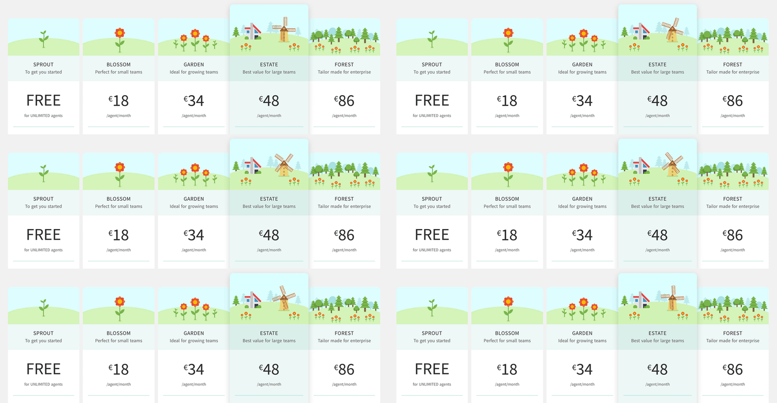
Freshdesk for the delightful use of animation
Highlighting the “best value” or “most popular” plan has been a strategy in SaaS for years. The thing is, such text is often meaningless and is really just there to pull attention towards a specific plan. Some businesses use color, size or other forms of visual accenting to do this. Freshdesk has gone one step further with animation! My eyes can’t help but be drawn to the ESTATE plan due to the simple, eye-catching animated illustration.
This is proof of how effective animation can be on the web, when used sparingly.
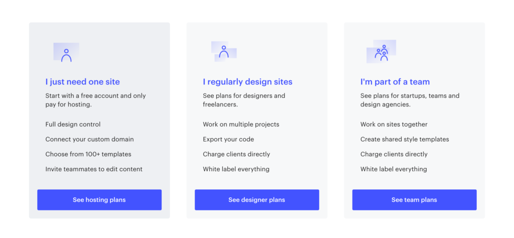
Webflow, for simplifying complexity
Some SaaS products grow and increase in complexity, especially in the way they’re priced. The Webflow product targets multiple personas:
- Individuals
- Freelance designers and website builders
- Full design teams
The solution for each of those categories of customer is very different – offering a combination of design tools, collaboration features through to white-labelling and client billing. This can result in a messy, confusing Pricing page with mixed messaging.
Instead, what they did was to add a sort of “pre-pricing” page, targeting each individual persona and directing them to their own specific pricing. Smart!
Part 4: Freemium or no Freemium?
As we wrote in our recent article on The two sides of Freemium, the Freemium model in B2B SaaS has seen some controversy. When implemented badly or without a solid strategy, Freemium can cost far more than it ever pays you back. However, it can also provide a huge boost to growth sparking a feedback loop of referrals and upgrades — particularly for SaaS businesses spanning the gap between Consumer and Enterprise.

What we learned
- Think about whether you want your free plan to be discoverable. Many businesses choose to de-emphasize their free offering, or even hide it.
- Try to visually differentiate your free plan, if it’s a radically-different (or limited) set of features.
- Be upfront about the limits of the free plan – this will help visitors make the decision.
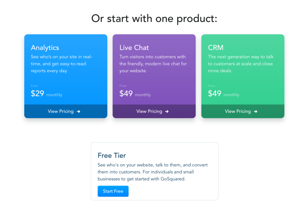
Example: GoSquared, for differentiating their Free tier
Increasingly, SaaS businesses are moving away from positioning their Free tier on the same level as those that are paid. The idea behind this is to avoid visitors directly comparing Paid with Free — instead seeing the free option as a different, usually much more limited version of the product.
GoSquared is a good example of this. The messaging is clear, honest and differentiated from the paid plans:
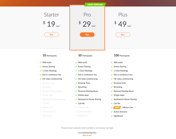
GoToMeeting, for hiding their Free plan
You have to have good eyesight if you want to find the Free plan for GoToMeeting (see if you can find it in the screenshot below). It’s clear that they want the focus of this page to be purely on the paid offering.
So why put the Free plan there at all?
They want it to be there for the people who are specifically looking for it — not discoverable by those who didn’t know it existed.
Part 5: Scalable pricing
SaaS pricing is often more complex than a simple 3-tier structure. In the majority of cases, the pricing will also scale based on a variable such as “seats” or “active customers”, adding another dimension to the cost. A scalable pricing structure is your chance to make sure your product is valuable for both small businesses and large enterprise customers.
Representing this additional complexity on the Pricing page can be tricky if you’re trying to avoid complex pricing matrices or calculators. Many of the businesses we studied take different approaches to this, with varying complexity.
Remember that the design of your scalable pricing structure sets your path for revenue expansion for customers in the future. Modelling this in detail is always a good idea, avoiding potentially-painful changes to the pricing structure further down the line.

What we learned
- It’s good to be explicit about how your pricing scales, rather than saying “starting from $x” – surprises aren’t fun for users.
- Pricing calculators can be a sign that your pricing is too complex.
- Make any interaction fun (or at least pleasant) to use – any positive reinforcement here can sway the visitor’s decision!
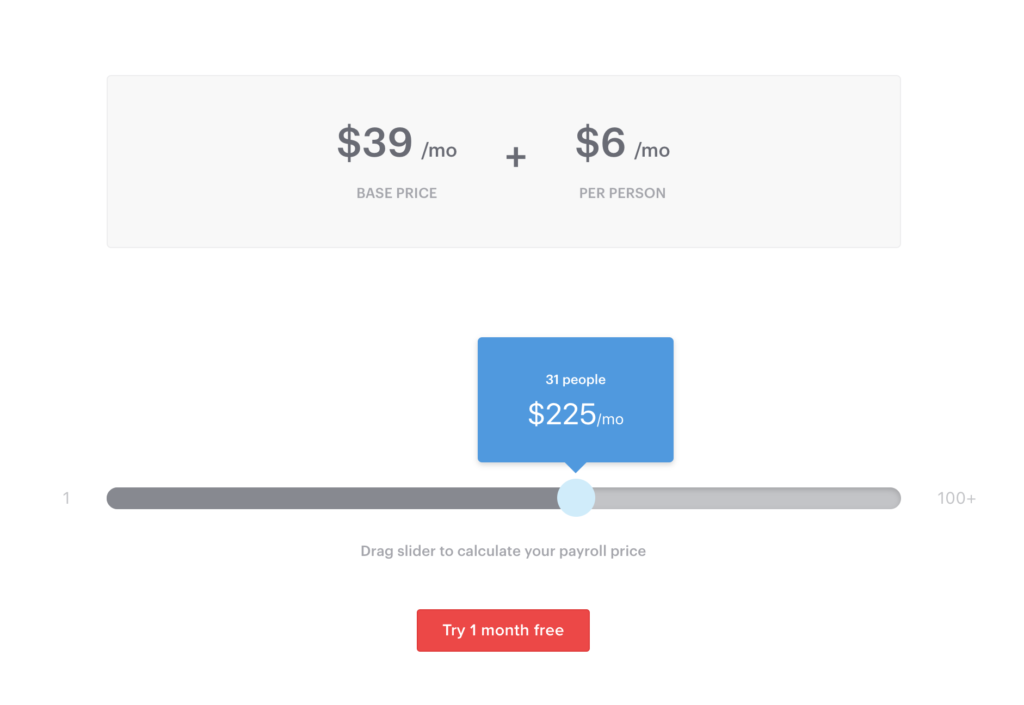
Example: Gusto, for the simple slider
We saw a lot of examples of the interactive pricing slider this year — definitely more than in 2015. It remains a great way to make the pricing page engaging (users interact and play with it) and the cost transparent to visitors.
Gusto is a great example of this, allowing visitors to use the slider and select the number of people in the company:
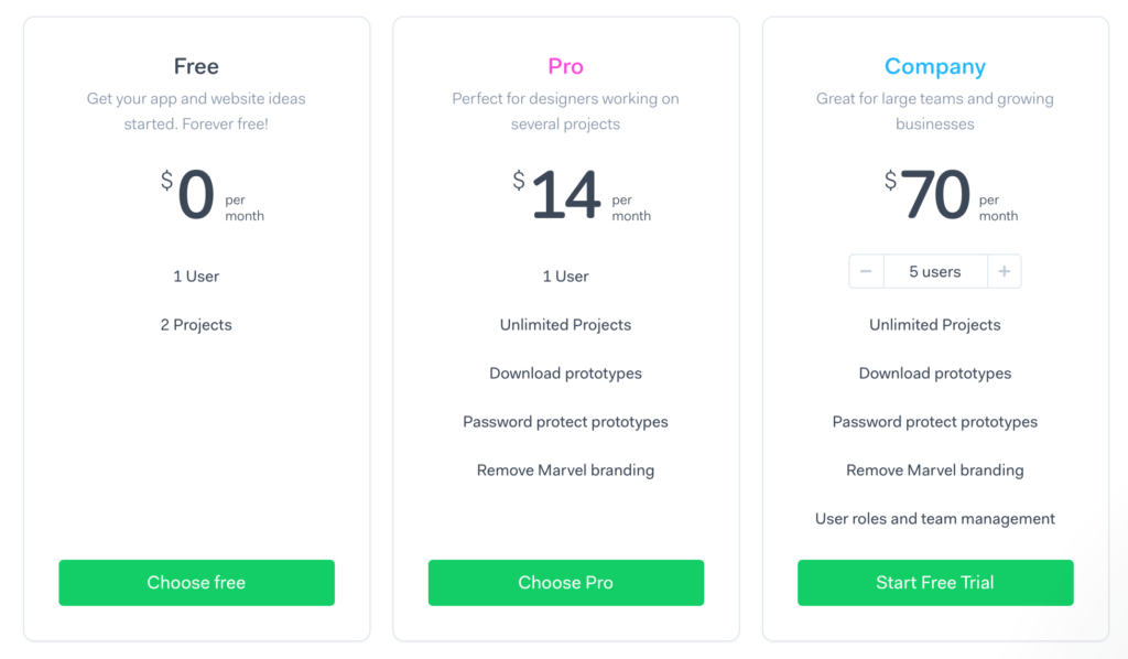
Example: Marvel, for inline plan scaling
The price of Marvel’s Team plan scales per user. The team have handled this really nicely by designing the scaling into the plan – allowing you to select the number of users inline. No pricing calculator required!
Part 6: Pricing add-ons
Add-ons are an increasingly popular trend in SaaS, especially where services can be unbundled into smaller confined solutions. The result is a more customised product for customers, who can add whichever add-ons they see value in.

What we learned
- Add-ons require careful thinking about the parts of your product you consider “core” and those that could be unbundled.
- They usually result in a more complex pricing structure in your own system – you can end up with one “plan” for every combination of add-ons.
- The unbundled add-ons need to offer a clear, standalone value proposition to visitors for them make sense.
- They can work really well when offering more specialized or niche functionality not everyone would want to pay for.
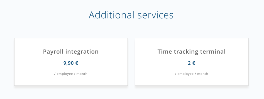
Example: HeavenHR
We picked out European HRM startup HeavenHR here, as they give a very simple overview of add-ons to their core pricing. Nothing fancy here, nothing hidden.
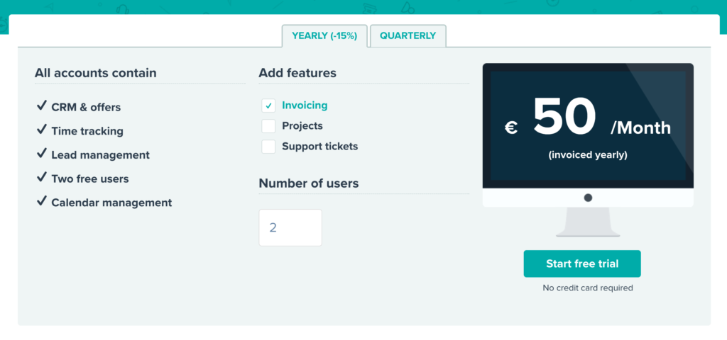
Example: Teamleader
Teamleader goes one step beyond the basics with add-ons, with a “build your own” feeling, rolling the scalable pricing and add-on selection into a single pricing calculator. Visitors can simply select the features and number of users they need, and see the final price instantly.
Part 7: Feature comparisons
We always talk about selling value, not features when it comes to marketing a SaaS product. So why is it then nearly 70% of businesses in our analysis include a feature table on the pricing page? No matter how you present the value of your product on your website, there comes a point where certain visitors just want to see a list of features. This is especially true for Enterprise customers and larger businesses who have a “preferred” feature set in mind before they even land on your site. For these businesses, listing out the features of your platform simply allows them to check all the boxes when evaluating your solution.
What we learned
- There’s nothing wrong with a table, which is usually the clearest way to convey this information!
- Add tooltips to the feature names, for deeper description of features that may not be obvious.
- Consider displaying “coming soon” features here, if they’re significant and may affect visitor’s decisions.
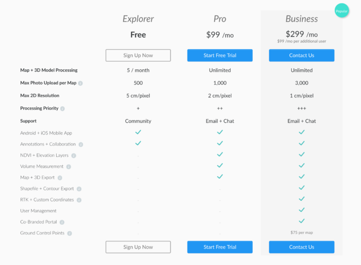
Example: DroneDeploy
There are so many giant, complex or plain boring SaaS feature comparisons out there (trust me, I’ve seen them all) and DroneDeploy’s isn’t one of them. This version:
- Is simple
- Picks a sensible level of detail for features
- Has tooltips for expanded feature details
- Is visually pleasing
- Has Call To Action buttons
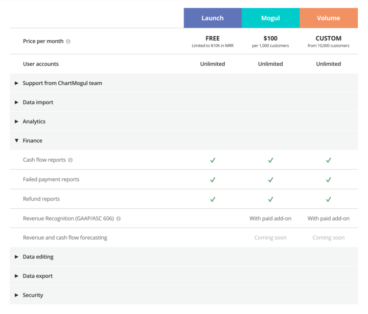
Example: ChartMogul
Feature comparison for complex products and platforms can be difficult — there are a lot of features considered important by some users. At ChartMogul, we designed a collapsible table of categorized platform features. This allows visitors to drill down and dig into categories of features they care about, without being overwhelmed by a giant table requiring endless scrolling.
Part 8: Free trial (or no free trial)
The free trial is a staple of most B2B SaaS solutions — many visitors will look for the trial signup button — a cry of “just let me see the thing” rather than digging around in marketing pages. This is fine, provided you can give a great self-service trial experience to customers. Onboarding is critical here, and in certain cases it may be better to push for a product demo or sales call. Check out some examples of this below.

What we learned
- Offering a free trial usually makes sense UNLESS you’re primarily targeting Enterprise businesses, or it’s just not possible to give a smooth self-service onboarding experience.
- The lines between a free trial and Freemium are becoming blurred. There are benefits and drawbacks to both. (Read this article on the two sides of Freemium SaaS)
- The term “No credit card required” is used by almost every business offering a trial. Users will look for this and expect it.
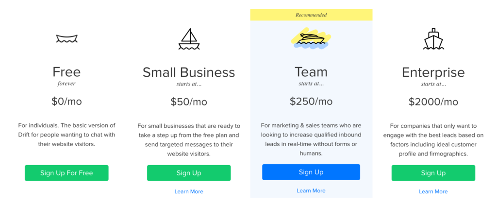
Example: Drift
Drift doesn’t have a free trial, but they do have a “forever free” (Freemium) plan:
Example: Base CRM
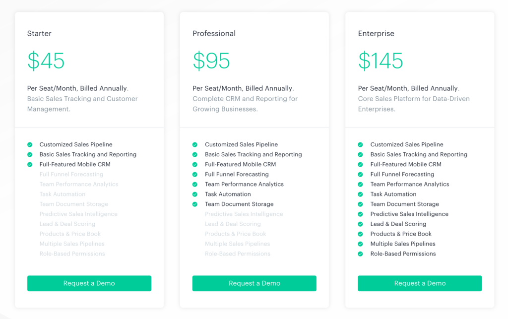
Interestingly, Base does have a free trial, but it’s not linked from anywhere on the Pricing page. You only have to look at the screenshot below to see the event they’re trying to push visitors towards: A product demo. For more Enterprise-focused platforms, the demo route can be beneficial. Complex products are best demonstrated by real people (rather than self-service trials). Enterprise customers are more comfortable with this method of buying, where their questions can be answered and custom pricing can be discussed.
Part 9: Social proof
Social proof on SaaS websites takes many forms:
- Human faces
- Customer logos
- Testimonial quotes
- Videos
- Social media posts
…and other more experimental ones!

Example: Leadpages for experimental social proof
If you go to the Leadpages Pricing page and wait for a few seconds, you’ll probably see one of these popping up in the bottom corner of the page:

This is a form of social proof that I’ve never seen before in SaaS.
The goal of this is clear: To reassure visitors and inspire confidence by saying “Look! All of these people are buying the product right now, and we’re showing them to you in real time!”
Is it a genuine real-time feed of people purchasing the product? I don’t know. Does it work? Well, what do you think?
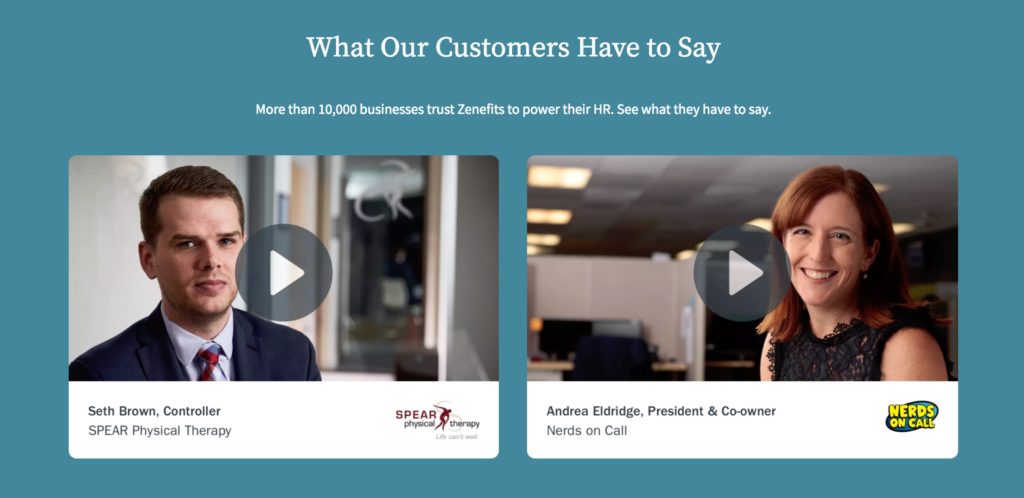
Example: Zenefits, for professional-looking customer videos
As we covered in our SaaS Landing Pages analysis, Zenefits does a great job of providing social proof in the form of really slick customer testimonial videos. This is no different on the pricing page, where you’ll also find a selection of videos. Clearly, Zenefits understands the important of social proof throughout their site.
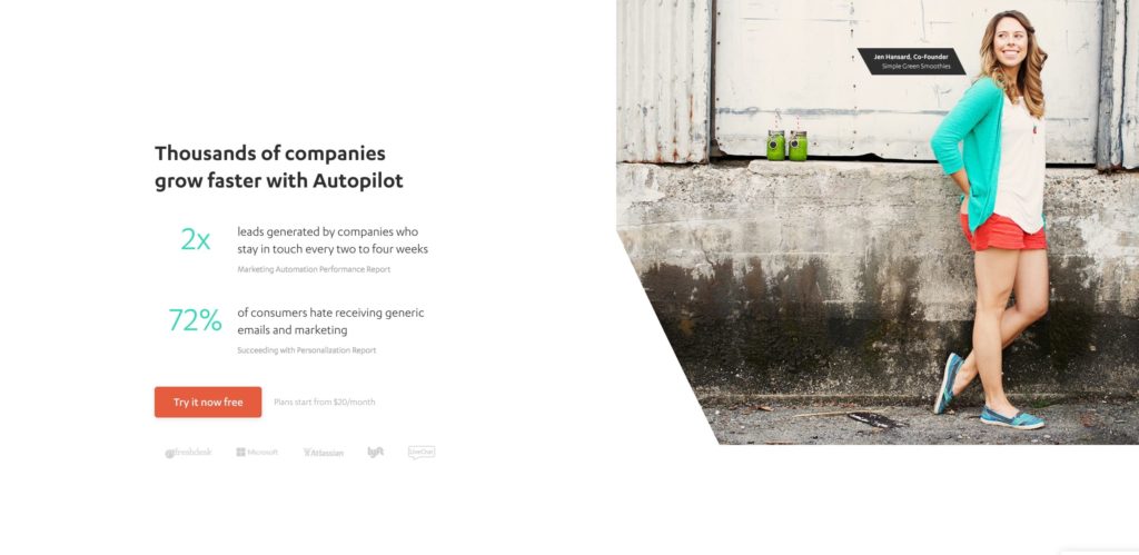
Example: Autopilot, for putting customers front and center
The Autopilot pricing page is full of different forms of social proof – logos, quotes, photos – and they all revolve around the success of their customers:
Takeaways
Designing a SaaS Pricing page in 2017 is no less complex than it was two years ago. Despite the convergence of certain elements, and common trends in the industry, there’s no getting away from the fact that you need to give every single aspect of the page considerable thought – from every angle possible.
The most engaging, interesting pricing pages in our study took existing concepts and pushed them into new areas, leveraging modern UX techniques to convey information accurately but also nudge visitors towards that all-important Signup button.
The study here is proof that B2B pricing can be presented in engaging way that’s delightful to navigate. We hope that the data and examples above can provide your own team with inspiration when it comes to putting your own site together. Good luck!
Did you find this analysis valuable? Please consider sharing the post with your own audience:
NEW: B2B SaaS pricing pages in 2017: Lessons from 100+ top businesses https://t.co/59FmegRkVZ #SaaS #pricing pic.twitter.com/QZWeAKAN8M
— ChartMogul (@ChartMogul) July 20, 2017
